Insights on visualisation, approvals, and presentation clarity
Thoughtful articles for interior design studios that want stronger presentations, clearer client communication, and a more effective visualisation process.
Why Sketches and Mood Boards Are Costing Your Studio Approvals: The Case for Photorealistic Visualisation
Why Sketches and Mood Boards Are Costing Your Studio Approvals: The Case for Photorealistic Visualisation
Sinan Alajrad, Founder & Creative Director of SinanDesigns, partnering with interior design studios to create 3D visualisation that improves presentation clarity and speeds approvals.
The invisible barrier to project approval
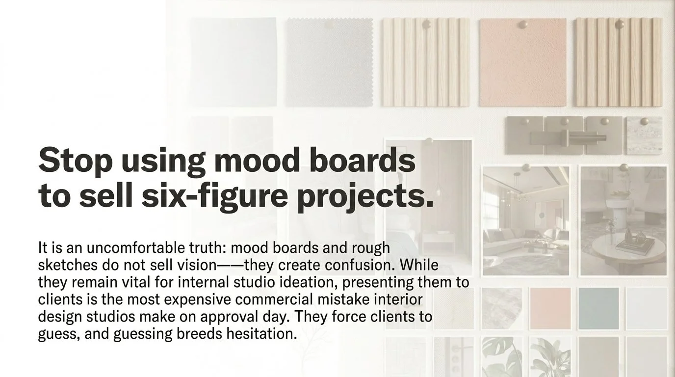
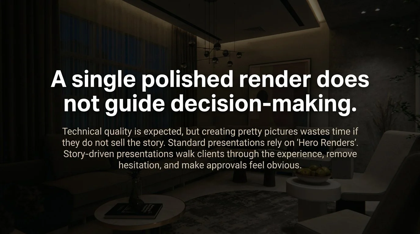
In high-end interior design, the gap between what the studio sees and what the client understands is rarely discussed. Yet it is one of the most expensive problems a studio faces. Many studios continue to rely on presentation tools that actively work against client confidence: flat mood boards and basic line drawings.
The core problem is straightforward. Forcing a high-value client to imagine a space before committing to it is a significant business risk. When a designer looks at a line drawing, they see resolved spatial intent. When a client looks at the same drawing, they see uncertainty. When you ask a client to fill in the blanks of a six-figure investment decision, they do not fill them with excitement. They fill them with doubt.
If a client cannot feel the spatial volume, the weight of the materials, or the quality of the light, they cannot confidently say yes. Removing the burden of imagination is not an aesthetic choice. It is a commercial one.
Why Sketches and Mood Boards Are Costing Your Studio Approvals: The Case for Photorealistic Visualisation
Why mood boards are the most expensive mistake on approval day
Mood boards are often beautiful. A carefully assembled palette of honed bronze, sandblasted concrete, natural wood veneer, and wool-textured fabric communicates a designer's intent clearly within the studio. But a material list is a technical instruction, not a design conversation.
Tactile swatches and flat samples are essential to the studio's internal process. They fail, however, to communicate a finished and lived-in vision to a client who has not been trained to assemble those textures into a cohesive environment in their mind.
When a presentation depends entirely on flat components, the studio is asking the client to perform a professional task they are not equipped for. Visual ambiguity is the primary cause of approval hesitation. And hesitation, left unresolved, becomes delay, revision, and eroded trust.
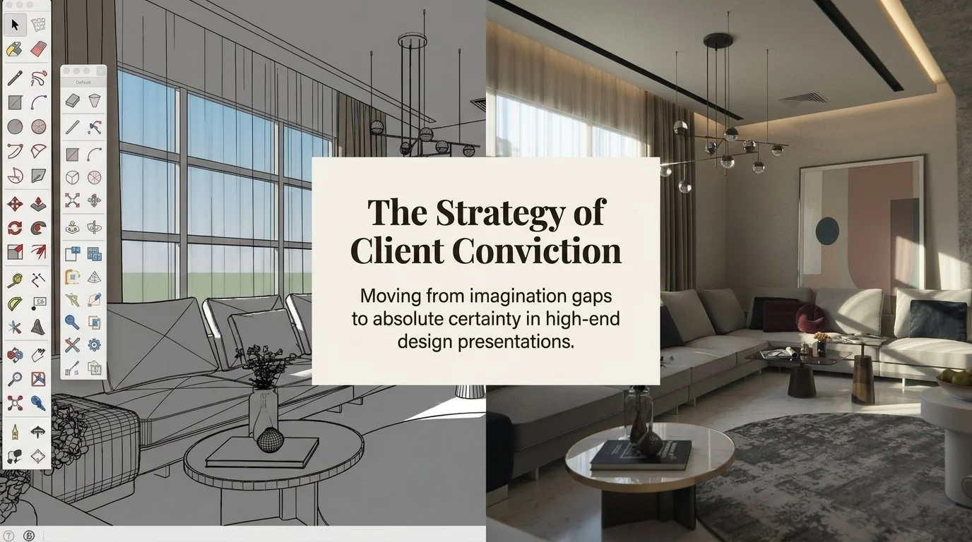
From SketchUp grey to spatial certainty
From SketchUp grey to spatial certainty
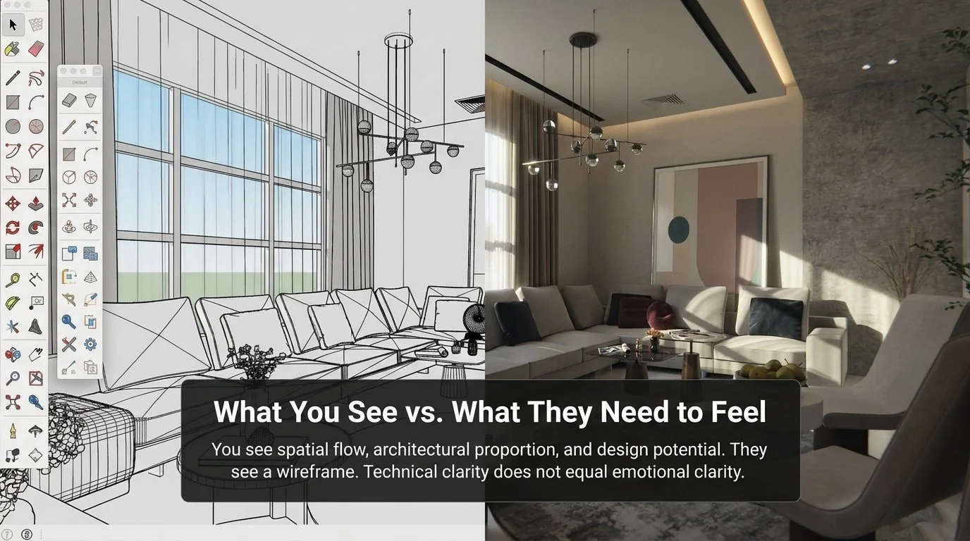
There is a significant psychological difference between the cold linework of an untextured 3D model and the warmth of a cinematic, photorealistic render. In the visual ambiguity phase, clients are confronted with grey geometry and clinical spatial outlines. They see the what. They are left guessing at the how.
Photorealistic visualisation resolves this uncertainty by demonstrating exactly how light behaves across a specific surface. It replaces a generic wall with the rhythmic depth of fluted timber panels and the quiet glow of integrated LED strip lighting. It replaces a seating plan with the physical presence of sculptural lounge chairs on a circular rug, in the exact material finish the designer has specified.
Photorealism closes the gap before the client meeting even begins. It shifts the conversation from "what will this look like?" to "how soon can we move forward?"
Why Sketches and Mood Boards Are Costing Your Studio Approvals: The Case for Photorealistic Visualisation
Photorealistic visualisation as a commercial tool
Visualisation is often framed as an aesthetic add-on, something that makes the presentation look more impressive. That framing undersells its real function.
High-quality visualisation is a commercial tool designed to make approvals feel straightforward. The strategic benefits are measurable.
Timeline compression. Eliminating the "let me think about it" phase moves projects into procurement and production weeks ahead of schedule.
Revision reduction. Clients who can see the resolved design respond with specific, actionable feedback rather than vague requests for change. Revision cycles shorten because the starting point is clear.
Confidence at the point of commitment. When a client can see the finished environment, the psychological barriers to signing off are removed. The decision feels obvious rather than risky.
The craft behind conviction: lighting and composition
Producing visualisation that converts requires more than technical software proficiency. It requires design intelligence applied to every decision in the scene.
A single lighting decision changes the emotional reading of an entire space. An evening scene with warm temperatures and directional shadows creates a sense of sanctuary that a bright midday render cannot. Strategic placement of pendant lighting provides atmospheric depth that signals quality and comfort without stating it directly.
Compositional choice is equally deliberate. A low camera angle places the viewer inside the space rather than observing it from above. It creates a visceral sense of scale, guides the eye through the room, and makes the experience feel personal rather than diagrammatic. These decisions demonstrate that the visualiser understands the project's intent, not just its geometry.
Why Sketches and Mood Boards Are Costing Your Studio Approvals: The Case for Photorealistic Visualisation
Breaking the revision cycle: a practical example
A project that had stalled for six weeks due to an unclear visual brief is a pattern many studios will recognise. The client was uncertain. The studio was sending updated drawings and revised mood boards. The cycle continued without resolution.
The shift came when photorealistic renders replaced the flat presentation entirely. Once the client could see the precise interaction of brushed walnut against sandblasted concrete, the specific quality of light across the material surfaces, and the spatial atmosphere of the resolved design, the uncertainty was gone. The project moved into production within days.
That shift reframes the visualiser's role. It is not a render factory. It is a thinking partner that understands the commercial pressure behind the design process.
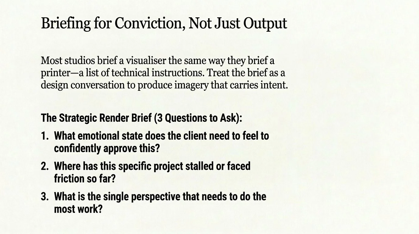
Briefing for intent, not just instruction
If you want approvals that feel effortless, the briefing process must go beyond a list of materials and camera angles. Imagery that carries design intent requires a conversation about what the client needs to feel in order to be confident.
Before your next presentation, consider three questions.
What does the client need to feel to say yes? Are you selling safety, status, or a sense of sanctuary?
Where has the project stalled so far? What specific moment in the presentation is generating the most hesitation?
What is the single image that needs to do the most work for this project?
The era of imagination-heavy presentations has passed. When you provide total visual clarity, you provide the only reliable path to a confident and committed yes.
Why Sketches and Mood Boards Are Costing Your Studio Approvals: The Case for Photorealistic Visualisation
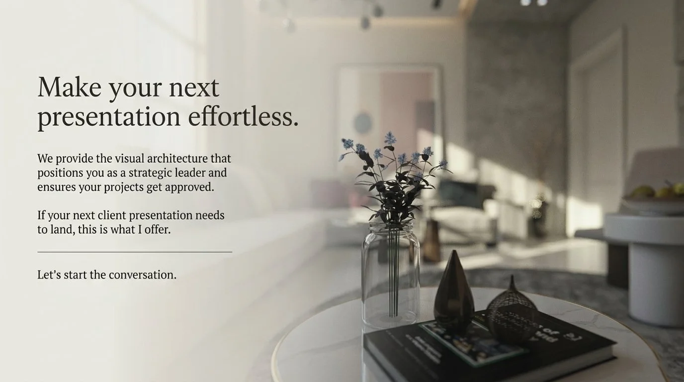
Work with a visualisation partner who understands design, not just software.
SinanDesigns works with interior design studios in Adelaide and across Australia to produce 3D visualisation that strengthens presentations, reduces revision cycles, and helps clients make confident decisions.
Explore the portfolio at sinandesigns.com.au/portfolio or book a free 15-minute consultation to discuss your next project.
Frequently Asked Questions
Why are mood boards not enough for client approvals? Mood boards present individual materials in isolation. They require the client to mentally assemble those elements into a finished environment, a task most clients are not trained for. The result is visual ambiguity, which creates hesitation and delays. Photorealistic 3D visualisation removes this burden by showing the finished design as a resolved, lived-in image.
How does 3D visualisation reduce design revision cycles? When clients respond to a photorealistic image rather than a drawing or mood board, their feedback is specific and grounded in what they can see. Vague requests for change are replaced by precise, actionable input. This reduces revision rounds significantly and moves projects toward approval more efficiently.
What is the difference between a 3D render and a mood board? A mood board assembles reference materials and sample swatches to communicate a design direction. A 3D render is a photorealistic digital image of the actual proposed space, showing the correct materials, lighting, furniture, and finishes as they will appear in the finished environment.
Can photorealistic visualisation speed up project approvals? Yes. When clients can see the resolved design clearly, decision-making becomes faster and more confident. The approval stage shifts from negotiation and imagination to straightforward confirmation of what the client has already seen and responded to positively.
Why Sketches and Mood Boards Are Costing Your Studio Approvals: The Case for Photorealistic Visualisation
Sinan Designs is a 3D interior visualisation studio based in Stepney, Adelaide, South Australia. The studio produces photorealistic render packages for interior design studios, architects, and property developers across Adelaide and Australia-wide.

What Is 3D Interior Visualisation? A Complete Guide for Australian Design Studios and Property Developers
What Is 3D Interior Visualisation? A Complete Guide for Australian Design Studios and Property Developers
Sinan Alajrad, Founder & Creative Director of SinanDesigns, partnering with interior design studios to create 3D visualisation that improves presentation clarity and speeds approvals.
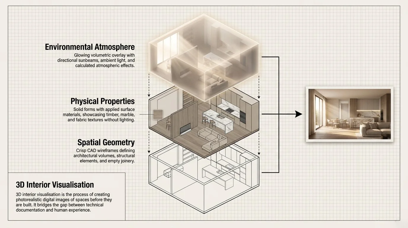
Definition
3D interior visualisation is the process of creating photorealistic digital images of interior spaces before they are built or renovated. Using specialist software, a visualisation artist constructs a three-dimensional model of a room or building interior, applies accurate materials and lighting, and renders the result as a high-resolution image or animation.
The output, commonly called a 3D render or interior render, allows clients, architects, designers, and developers to see exactly how a space will look before any physical construction begins.
In Australia, 3D interior visualisation is used across residential design, commercial fit-outs, hospitality projects, retail environments, and property development to support client presentations, development approvals, pre-sales campaigns, and marketing materials.
A Complete Guide for Australian Design Studios and Property Developers
How 3D Interior Visualisation Works
The production of a 3D interior visualisation typically follows a structured process:
1. Brief and file intake: The designer or client provides CAD files (DWG or DXF format), floor plans, elevations, and material specifications. A briefing call clarifies design intent, preferred atmosphere, camera angles, and key moments to capture.
2. 3D modelling: A digital model of the space is constructed using the supplied drawings as reference. Furniture, joinery, architectural elements, and fixtures are modelled or sourced from specialist 3D asset libraries.
3. Material and lighting development: Surface materials — timber, stone, fabric, glass, metal — are applied with accurate physical properties. Lighting is developed to reflect the intended mood of the space, whether natural daylight, artificial evening light, or a combination.
4. Rendering: The completed 3D scene is processed through a render engine, which calculates how light interacts with every surface. This is the computationally intensive stage that produces the final photorealistic image.
5. Review and refinement: The initial render is reviewed by the studio or client. Adjustments to composition, materials, lighting, or camera angle are made before final high-resolution images are delivered.
Industry-standard software used in Australia includes 3ds Max, V-Ray, FStorm, D5 Render, Lumion, and Enscape.
A Complete Guide for Australian Design Studios and Property Developers
Types of 3D Interior Visualisation
Still renders
Single photorealistic images of a space, typically from one or more carefully chosen camera angles. Still renders are the most common deliverable and are used for client presentations, approval submissions, and marketing.
Render packages
A curated set of 6–12 still renders covering key spatial moments across a project — entry sequence, hero living spaces, material details, day and night conditions. Designed to function as a complete visual story for a single presentation.
Day-to-night sequences
Pairs of renders showing the same space under daylight and evening lighting conditions. Used to demonstrate how artificial lighting design performs and how a space changes character across the day.
3D walkthroughs and animations
A moving sequence through a space, typically rendered as a video file. Used for marketing campaigns, developer pre-sales, and presentations where a static image cannot convey circulation or spatial flow.
Virtual reality (VR) renders
Interactive 3D experiences that allow a viewer to move through a rendered space in real time using a VR headset. Used for high-value residential and commercial projects where immersive client engagement is required.
Clay renders (neutral pass)
Renders produced without final materials applied, using a uniform neutral tone across all surfaces. Used in the approval workflow to evaluate spatial proportion, lighting direction, and composition before committing to final finishes.
Who Uses 3D Interior Visualisation in Australia
Interior design studios
Interior designers use 3D visualisation to present concepts to clients before construction begins. Photorealistic renders help clients understand material palettes, spatial atmosphere, and design intent, reducing hesitation and revision cycles during the approval process.
Architects
Architectural practices use interior renders alongside exterior visualisation to present the full experience of a proposed building. For complex or high-value projects, interior renders help communicate design intent to clients, planning authorities, and development partners.
Property developers
Developers use 3D interior renders to support pre-sales of off-the-plan apartments, townhouses, and commercial properties. Buyers and investors are more likely to commit to a purchase when they can see the finished interior clearly, rather than relying on floor plans and specifications alone.
Builders and construction companies
Builders use renders to present proposed finishes and fitout options to clients, support display suite imagery, and differentiate their offering in competitive tender situations.
Retail and hospitality operators
Retail brands and hospitality operators use 3D visualisation to present proposed store designs or venue fit-outs to leasing agents, mall operators, franchise partners, and development approval authorities.
A Complete Guide for Australian Design Studios and Property Developers
Key Benefits of 3D Interior Visualisation
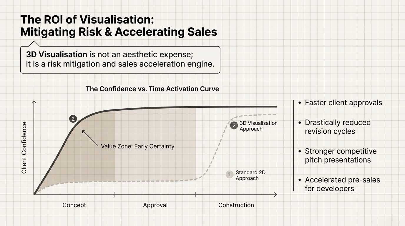
Faster client approvals When clients can see a photorealistic image of the proposed design, decision-making becomes faster and more confident. Uncertainty, the primary cause of approval delays, is reduced because the client is no longer being asked to imagine the outcome.
Fewer revision cycles Presenting a photorealistic render early in the design process surfaces questions and concerns before they become expensive changes. Clients can respond to what they see, rather than what they assume, leading to more specific and actionable feedback.
Stronger client presentations A high-quality render communicates the value and quality of a design more effectively than plans, elevations, or mood boards alone. This is particularly important in competitive pitch situations, where the studio that presents most clearly often creates stronger confidence.
Pre-sales and marketing support For property developers, interior renders are a core marketing asset. They appear in advertising campaigns, on real estate platforms, in display suites, and in investor presentations, often before a single wall has been built.
Development approval submissions In Australia, many local councils and development authorities require visualisation as part of a planning or development approval submission. Interior renders help demonstrate how a proposed fitout will impact heritage buildings, mixed-use precincts, or sensitive urban environments.
3D Interior Visualisation Costs in Australia
Pricing for 3D interior visualisation in Australia varies based on the complexity of the space, the number of views required, the level of detail needed, and the turnaround time.
As a general guide:
Service type Typical range (AUD) Single interior still render $400 – $1,200Render package (6–10 views) $2,000 – $6,000+ Day/night sequence (per space) $800 – $2,0003D walkthrough animation (60 sec) $3,000 – $10,000+ Property developer package $5,000 – $20,000+
Factors that increase cost include complex architectural geometry, custom furniture and joinery modelling, large numbers of camera angles, animation, virtual reality output, and rush turnaround requirements.
Studios that provide incomplete briefs or low-resolution drawings typically incur additional modelling time, which increases cost. A well-prepared brief with complete CAD files, material specifications, and clear design intent is the most effective way to keep a project on budget.
A Complete Guide for Australian Design Studios and Property Developers
How to Choose a 3D Visualisation Studio in Australia
When selecting a 3D visualisation provider, consider the following:
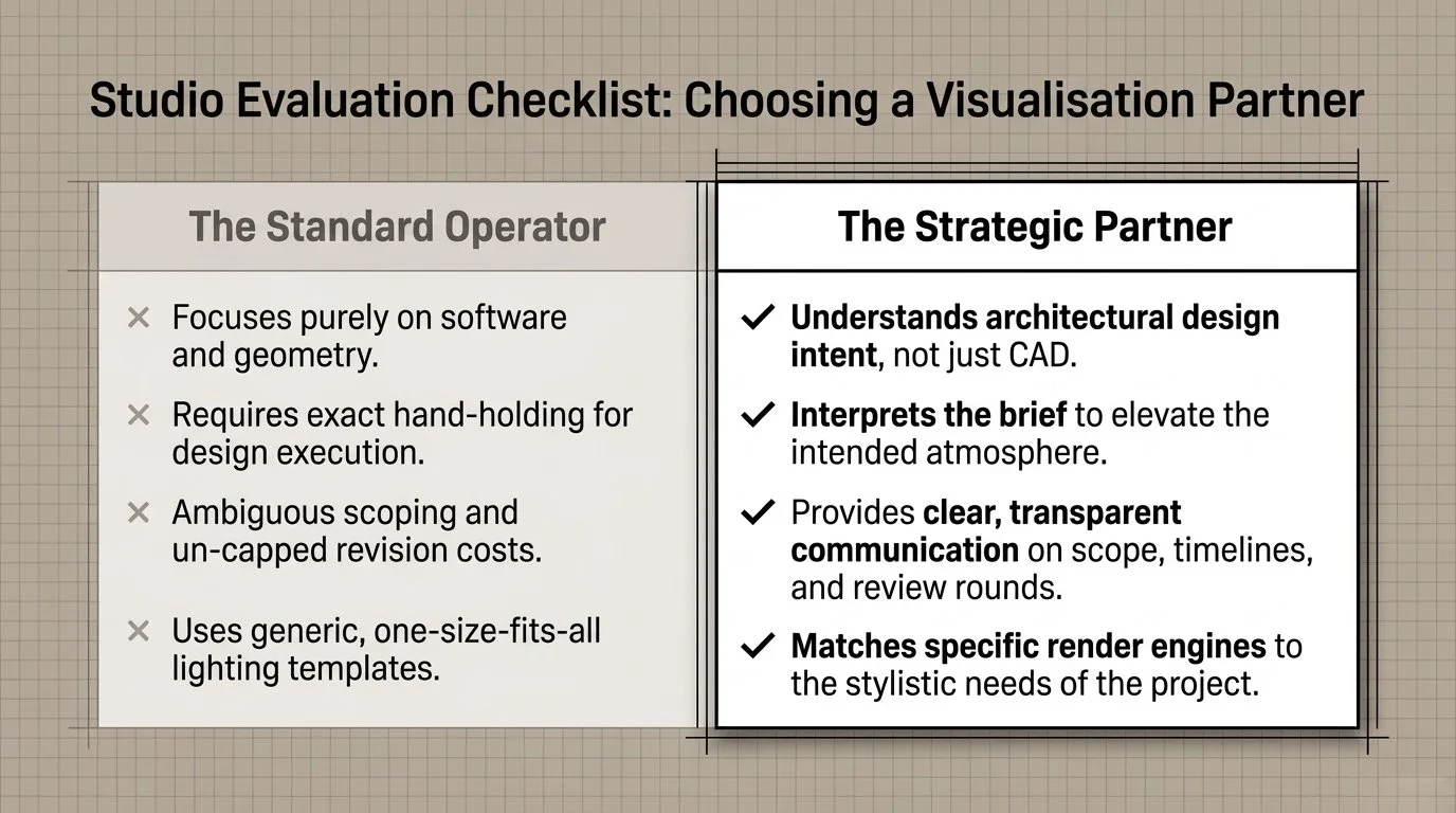
Portfolio quality and style match: Review the studio's existing work to assess whether the visual style, material accuracy, and lighting quality match the standard your project requires. A studio that specialises in residential interiors may not be the best fit for a commercial hospitality brief.
Understanding of design intent: The best visualisation studios understand design, not just software. A provider with a background in interior design or architecture will ask better questions, interpret the brief more accurately, and produce imagery that captures the intent of the design. not just its geometry.
Communication and process clarity: A reliable studio will define the scope, timeline, revision rounds, and deliverable format clearly before work begins. Ambiguity in the brief stage typically leads to misaligned expectations and additional revision costs.
Turnaround time: Standard turnaround for a 3D interior render package in Australia is 5–10 business days from brief sign-off. Rush turnaround is available from most studios at a premium. Confirm timelines in writing before committing.
Software capability: Industry-standard tools include 3ds Max, V-Ray, FStorm, D5 Render, Lumion, and Enscape. Different engines produce different visual qualities and are suited to different project types. Ask which engine the studio uses and why.
3D Interior Visualisation in Adelaide
Adelaide has a growing market for 3D interior visualisation, driven by active residential construction, boutique hospitality development, and a strong community of independent interior design studios.
Interior design practices across Adelaide's inner suburbs, including Norwood, Unley, Prospect, and the CBD, are increasingly using photorealistic visualisation as a standard part of their client presentation process, replacing or supplementing physical mood boards, material samples, and basic sketch renders.
For Adelaide studios working with clients across South Australia, interstate, or internationally, 3D visualisation provides a communication tool that works regardless of geography, allowing clients to understand and approve designs remotely with the same confidence as an in-person presentation.
Sinan Designs is a 3D interior visualisation studio based in Stepney, Adelaide. The studio works with interior design practices, architects, and property developers across Adelaide and Australia-wide, producing photorealistic render packages that support client presentations, development approvals, and pre-sales campaigns.
Frequently Asked Questions
What is 3D interior visualisation? 3D interior visualisation is the creation of photorealistic digital images of interior spaces before they are built. It uses specialist 3D modelling and rendering software to show how a space will look, including materials, lighting, furniture, and atmosphere.
How long does a 3D interior render take in Australia? A standard render package typically takes 5–7 business days from brief sign-off. Rush turnaround of 2–3 days is available from many studios at a premium. Complex projects with custom modelling requirements may take 10–15 business days.
What files does a 3D visualisation studio need to get started? Most studios require CAD files (DWG or DXF), floor plans, elevations, and material or finish specifications. The more complete the documentation, the faster and more accurate the first render preview will be.
What is the difference between 3D visualisation and rendering? The terms are often used interchangeably. Technically, rendering refers to the specific computational process of producing the final image from a 3D scene. Visualisation refers to the broader practice of creating imagery to communicate a design concept. In professional use, both terms describe the same service.
How much does 3D interior visualisation cost in Australia? A single interior render typically costs between $400 and $1,200 AUD. A full render package of 6–10 views typically ranges from $2,000 to $6,000+ depending on complexity, detail level, and turnaround time.
Can 3D visualisation be used for planning and development approvals in Australia? Yes. Many local councils and development authorities accept or require photorealistic visualisation as part of a planning application or development approval submission, particularly for heritage buildings, mixed-use precincts, and sensitive urban sites.
What software is used for 3D interior visualisation in Australia? The most widely used tools are 3ds Max, V-Ray, FStorm, D5 Render, Lumion, and Enscape. The choice of software depends on the project type, lighting complexity, and output format required.
Is 3D interior visualisation only for large projects? No. 3D visualisation is used effectively for single-room residential projects as well as large commercial developments. The decision to use it is typically based on the value of the design decision being supported — where client confidence and approval speed matter, visualisation adds value regardless of project size.
Do 3D visualisation studios in Australia work remotely? Yes. The entire process — brief, file transfer, review, and delivery — runs remotely. Most Australian studios work with clients across multiple states and internationally. Location does not affect quality or communication.
What is the difference between interior and exterior 3D visualisation? Interior visualisation focuses on the inside of a space — room layouts, materials, lighting, furniture, and atmosphere. Exterior visualisation shows the outside of a building — facade, landscaping, street context, and massing. Many projects require both. Some studios specialise in one or the other.

A Complete Guide for Australian Design Studios and Property Developers
Sinan Designs is a 3D interior visualisation studio based in Stepney, Adelaide, South Australia. The studio produces photorealistic render packages for interior design studios, architects, and property developers across Adelaide and Australia-wide.
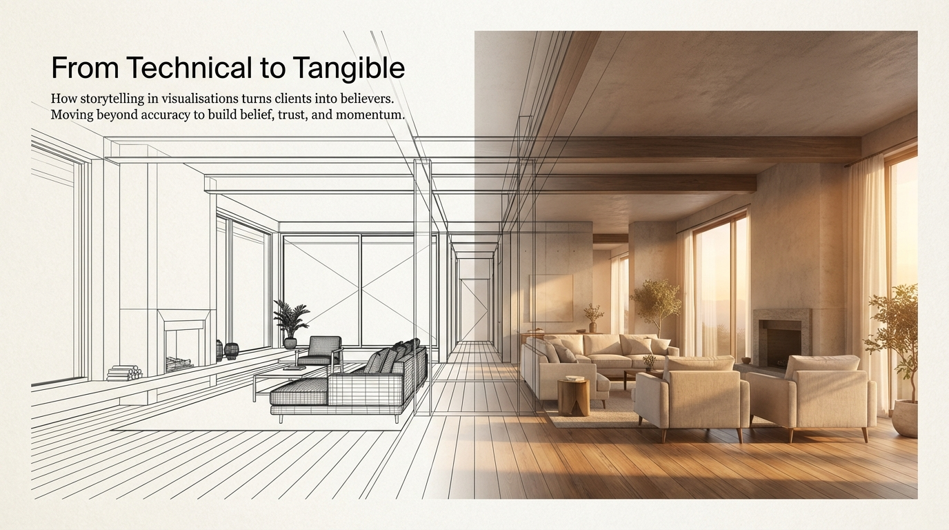
How Storytelling in Renders Builds Trust, Speeds Approvals, and Sells the Vision
A technically perfect render is not always enough. When a visual tells a story through lighting, composition, and atmosphere, clients connect with the experience, not just the specifications, and that often leads to faster decisions.
Sinan Alajrad, Founder & Creative Director of SinanDesigns, partnering with interior design studios to create 3D visualisation that improves presentation clarity and speeds approvals.
A render can be technically perfect and still fail to move the project forward.
The lighting may be balanced. The textures may be sharp. The composition may be clean. Yet the client still hesitates.
They look at the image and say something like:
“It’s beautiful, but I still can’t feel it.”
“Something feels missing.”
That missing piece is often not accuracy.
It is story.
In many presentations, renders are treated as technical displays of a design. They show the layout, the materials, and the dimensions, but they stop short of creating emotional connection. And when a render does not create connection, the project can remain stuck in hesitation.
Because clients do not only approve what they understand.
They approve what they believe in.
How Storytelling in Renders Builds Trust, Speeds Approvals, and Sells the Vision
Why technical accuracy alone is not enough
Accuracy matters. A professional visual has to communicate proportion, materiality, and design intent clearly.
But clarity on its own is not always persuasive.
A client may understand the room and still feel unsure about the outcome. They may see the plan, yet struggle to imagine the atmosphere. They may recognise the quality of the design, but not feel the experience of being inside it.
That is where storytelling changes the role of a render.
Instead of only showing what a project looks like, it starts showing why it matters.
How Storytelling in Renders Builds Trust, Speeds Approvals, and Sells the Vision
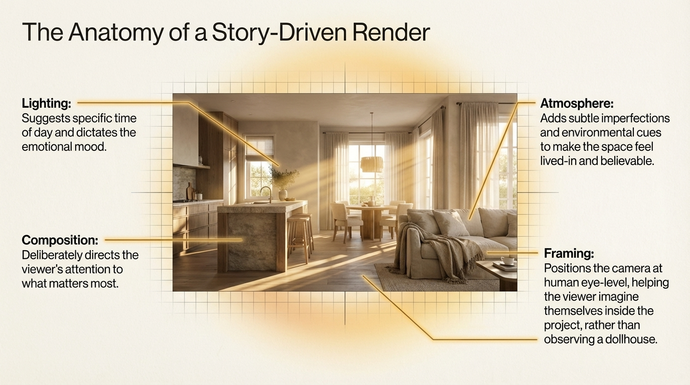
What storytelling in renders actually means
Storytelling in visualisation is not about making the image dramatic for its own sake.
It is about using visual decisions to guide emotion and meaning.
That can come through:
lighting that suggests time of day and mood
composition that directs attention to what matters most
atmosphere that makes the space feel lived-in and believable
framing that helps the viewer imagine themselves inside the project
When these elements work together, the render stops feeling like a static presentation board and starts feeling like an experience.
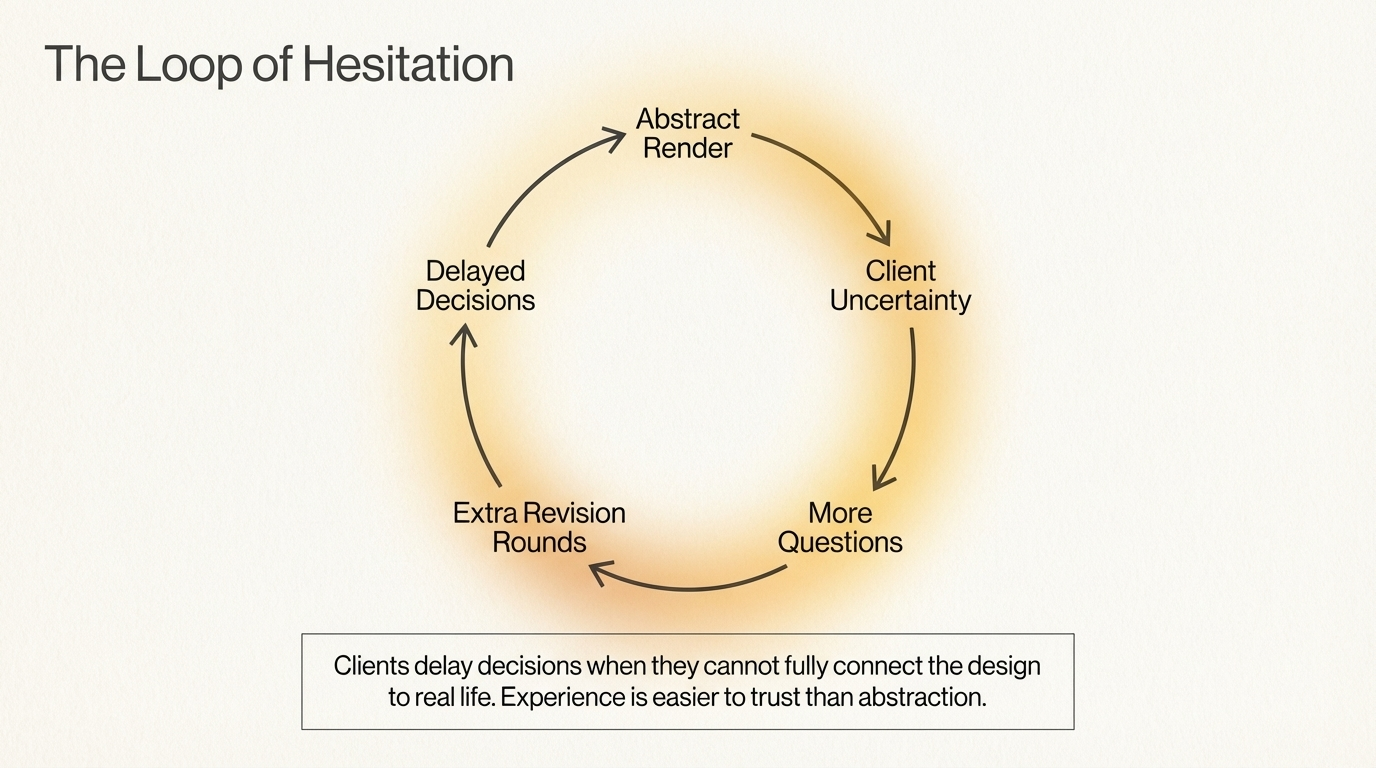
That shift is powerful because experience is easier to trust than abstraction.
Why emotion speeds approvals
Clients often delay decisions when they cannot fully connect the design to real life.
They may admire the visuals, but still feel unsure. That uncertainty creates slower feedback, more questions, and more revision rounds.
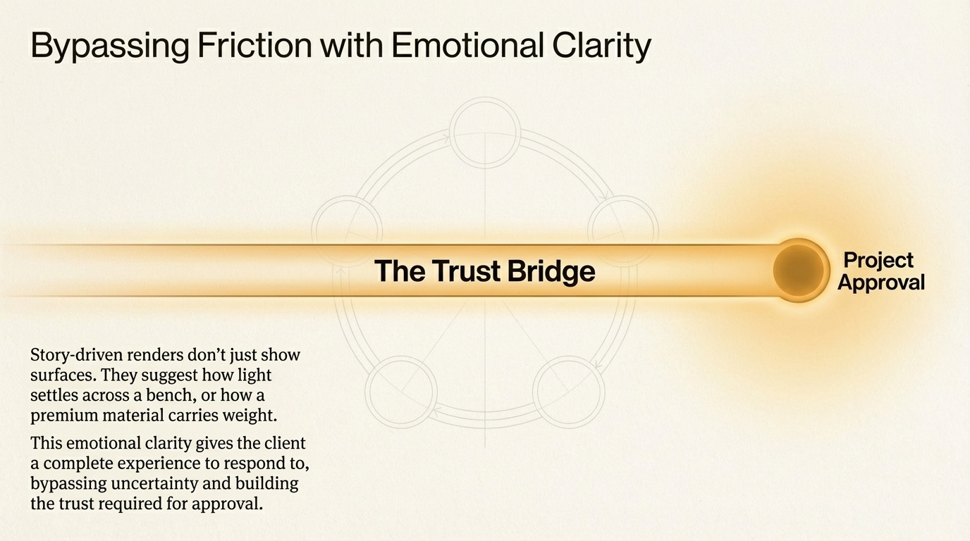
Storytelling helps reduce that friction because it gives the client something more complete to respond to.
A story-driven render does not just show surfaces. It suggests how the space feels in the morning, how light settles across a bench, how a room welcomes someone in, or how a premium material carries mood and weight.
That emotional clarity often makes decisions easier.
When clients can see the experience, they are far more likely to trust the direction.
And trust is what moves a project from interest to approval.
How storytelling helps real projects move faster
The difference between showing a space and selling a vision
A standard render can describe a project.
A story-driven render can sell the vision behind it.
That matters for:
interior designers seeking stronger client buy-in
architects presenting high-value concepts
builders trying to communicate confidence and quality
developers needing visuals that support pre-sales and momentum
In each case, the image is doing more than representing a design. It is building belief around it.
The three-part method behind stronger storytelling
A simple way to think about it is this:
1. Problem
Most renders show what a project looks like, but not why it matters.
2. Solution
Use lighting, composition, and atmosphere deliberately to create emotional connection and guide the viewer’s attention.
3. Product
Deliver a visual that feels real, believable, and persuasive, not only accurate.
This is the difference between an image that decorates a presentation and one that helps close the gap between concept and conviction.
What storytelling in renders actually means
How storytelling helps real projects move faster
When storytelling is used well in renders, it can improve several parts of the process at once.
It can:
make presentations more memorable
reduce hesitation in client meetings
create stronger emotional buy-in
support faster approvals
help premium projects feel more valuable before they are built
It also strengthens pre-sales and marketing because people tend to remember stories long after they forget specifications.
That is especially important when the goal is to sell the experience of a future space.
Why this matters in Adelaide
In a market where many presentations still rely on flat or purely functional imagery, stronger storytelling becomes a competitive advantage.
Studios that present with atmosphere and intent often create more confidence because they are not only explaining the design. They are helping the client feel the outcome.
That can make a real difference in how quickly a project gains momentum.
What a story-driven render should do
A strong render should not only look polished.
It should help the viewer:
understand the design clearly
feel the intended mood
recognise the value of the space
imagine themselves inside it
trust the project enough to make a decision
That is the benchmark.
Because when the image feels real, the conversation changes.
Final thought
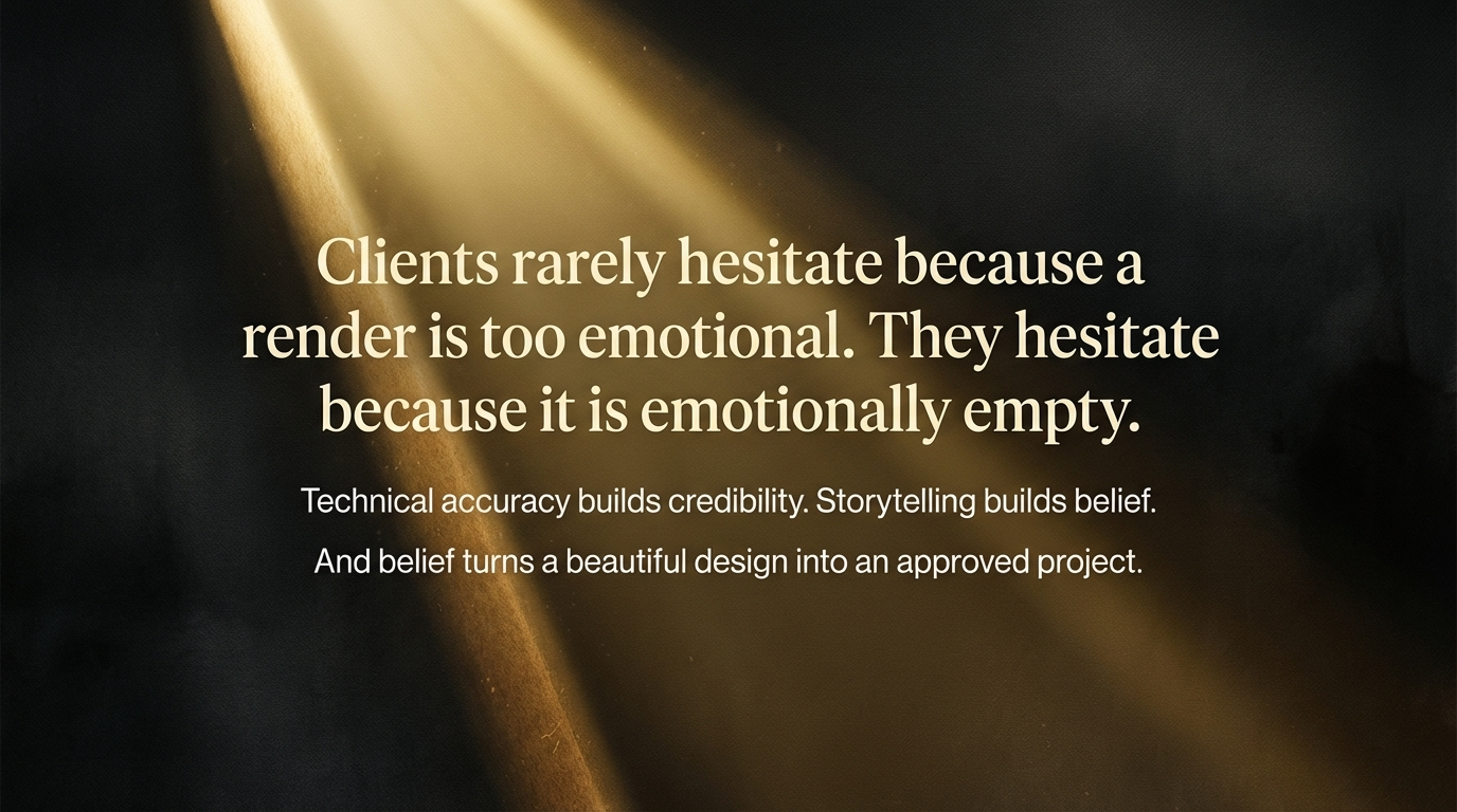
Clients rarely hesitate because the render is too emotional.
They hesitate because the image is emotionally empty.
Technical accuracy builds credibility.
Storytelling builds belief.
And belief is often the thing that turns a beautiful design into an approved project.
FAQ
Why is storytelling important in architectural renders?
Because clients respond more confidently when a render communicates atmosphere, emotion, and experience, not just layout and finishes.
Do storytelling-focused renders help win approvals faster?
They often do, because they reduce uncertainty and help clients connect more quickly with the design intent.
What makes a render feel more emotional?
Lighting, composition, atmosphere, framing, and subtle cues that make the space feel believable and lived-in.
Who benefits from story-driven visualisation?
Interior designers, architects, builders, and developers all benefit when stronger visuals create trust, excitement, and clearer decisions.
If your presentations are technically strong but still not creating enough confidence, I help interior design studios craft renders that do more than show the design. They help clients feel it, trust it, and move forward.
Explore the work, or get in touch to discuss your next presentation.
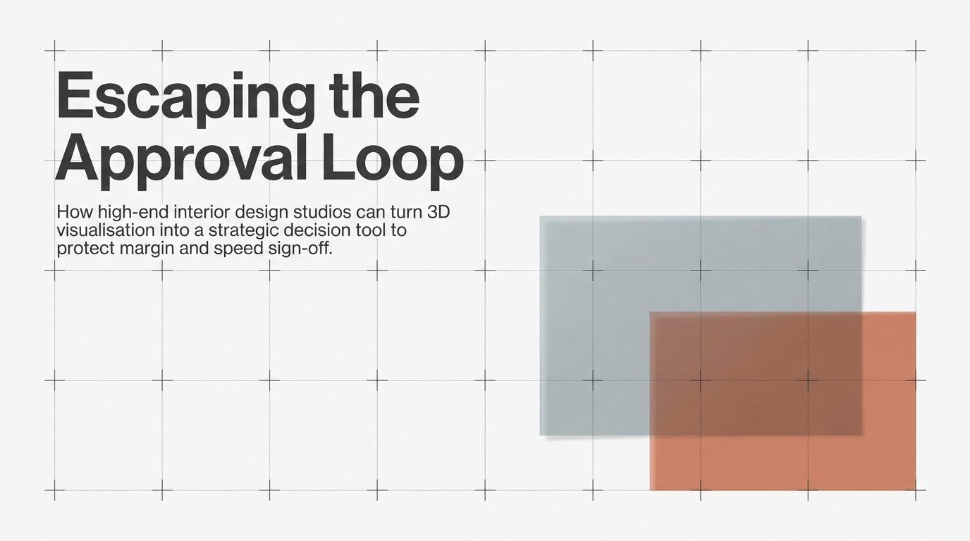
Why Great Interior Designs Stall, and How 3D Visualisation Speeds Approvals
Great interior concepts rarely stall because the design is weak. They stall because decision-makers cannot fully picture the outcome. Here is how a smarter 3D workflow helps studios reduce revisions and move clients from admiration to approval.
Sinan Alajrad, Founder & Creative Director of SinanDesigns, partnering with interior design studios to create 3D visualisation that improves presentation clarity and speeds approvals.
In high-end interior design, the problem is rarely a lack of creativity.
More often, great concepts get stuck in the approval loop: brief, clarify, revise, repeat. What should be a confident design process turns into hesitation, extra meetings, and mounting revision rounds.
For interior design studios, that loop is expensive. It stretches timelines, drains creative energy, and chips away at margin.
The issue usually is not that the design is weak. It is that too many questions remain unanswered at the moment the client is asked to decide.
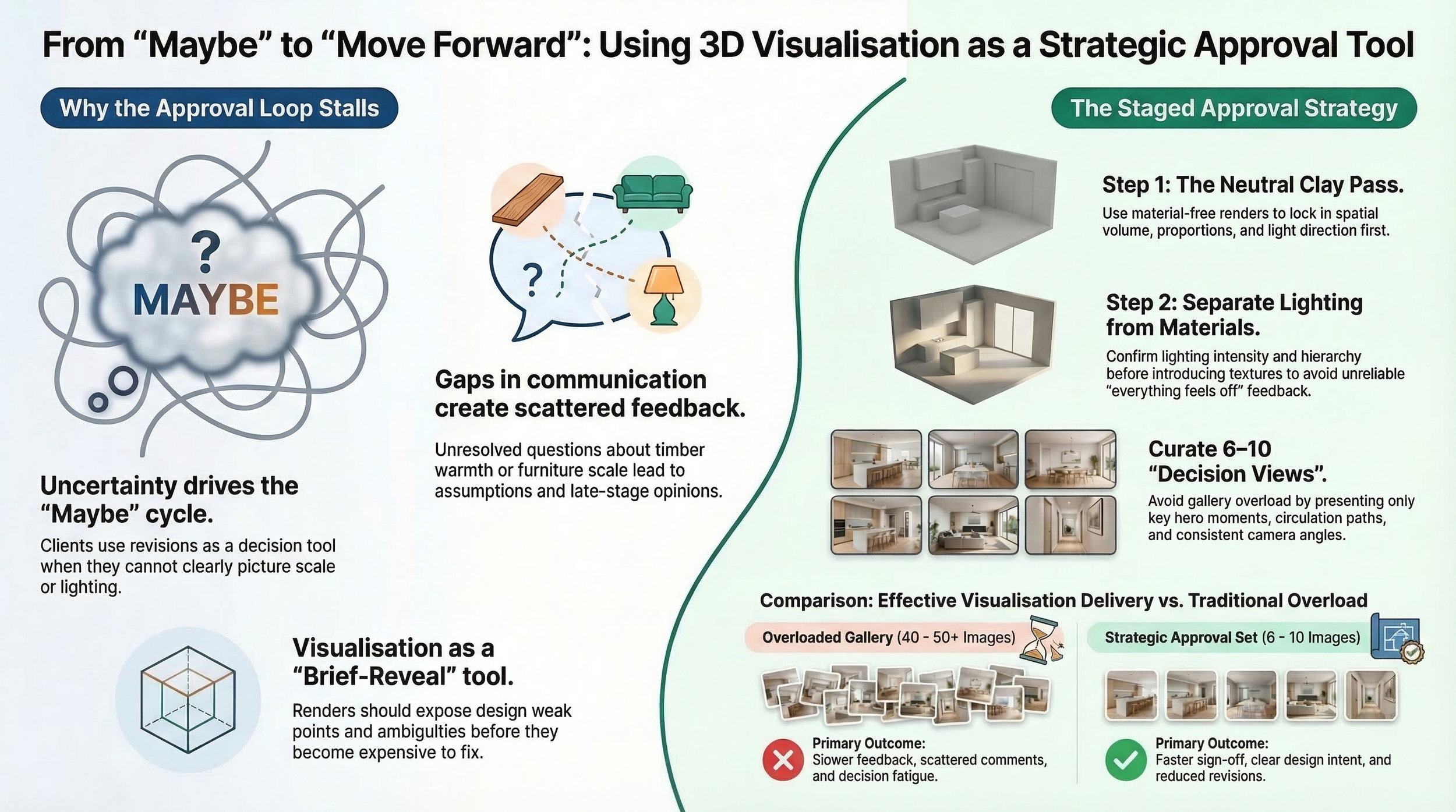
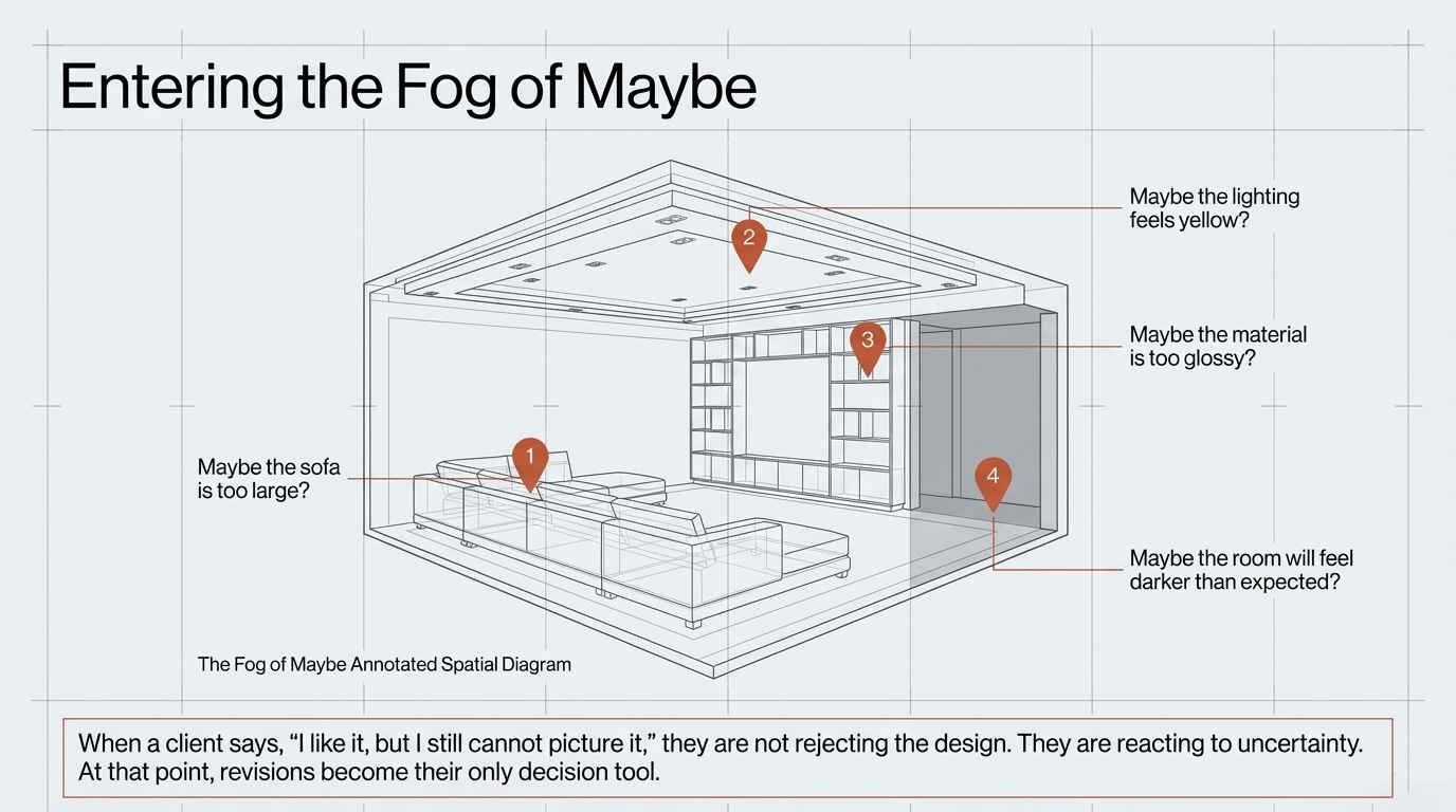
When a client says, “I like it, but I still cannot picture it,” they are not rejecting the design. They are reacting to uncertainty.
That uncertainty is where 3D visualisation becomes strategic.
Used properly, it does more than present a finished concept. It helps interior design studios reduce decision risk, guide feedback, and move clients towards faster, cleaner sign-off.
How 3D Visualisation Helps Interior Designers Win Faster Approvals
Why interior design approvals stall
Most prolonged revision cycles are not caused by bad design.
They are caused by gaps in communication.
A client may be unsure about the warmth of the timber, the feel of the lighting, the scale of the furniture, or how one zone connects to the next. When those questions are not resolved clearly, feedback becomes scattered. Stakeholders begin filling the gaps with assumptions, preferences, and late opinions.
That is where momentum slips.
A design that looked strong in plan or elevation suddenly enters a fog of “maybe”:
maybe the sofa is too large
maybe the lighting feels yellow
maybe the material is too glossy
maybe the room will feel darker than expected
At that point, revisions become the client’s only decision tool.
How 3D Visualisation Helps Interior Designers Win Faster Approvals
The real job of 3D visualisation
Many studios still treat visualisation as final polish.
In practice, its most valuable role is much earlier.
Good visualisation works as a brief-reveal tool. It exposes ambiguity before ambiguity becomes expensive. It helps the studio identify what still needs to be decided, what can be locked, and what should not be debated yet.
A render cannot rescue a weak brief. But it can reveal the weak points faster, and that gives the design team control.
For example, when a space is modelled with precision, issues that stay hidden in 2D often become obvious:
ceiling depth that feels heavier than expected
wall alignments that miss their intended junctions
feature elements that compete rather than support the composition
circulation that looks elegant on plan but cramped in perspective
That clarity protects both the project and the authority of the studio.
Separate lighting decisions from material decisions
One of the fastest ways to create messy feedback is to ask clients to judge lighting and materials at the same time.
When both are being evaluated together, reactions become unreliable. If a client dislikes the mood of the image, are they reacting to the finish, the lighting, or both?
That is why a staged workflow is so effective.
Step 1, start with a neutral clay pass
A neutral pass removes the distraction of finishes and lets the client focus on spatial volume, proportions, light direction, and overall atmosphere.
Step 2, lock the lighting
Before discussing sheens, textures, or tones, confirm the lighting logic of the space. That means the intensity, warmth, contrast, and focal hierarchy are settled first.
Step 3, move into the material pass
Once the lighting is approved, materials can be judged properly. At that stage, feedback becomes far more precise because the client is no longer reacting to two variables at once.
This single shift can dramatically reduce the “everything feels off” type of review session.
Curate fewer images, get faster decisions
More renders do not automatically create more confidence.
In many cases, they create overload.
A client shown 40 or 50 images is not being guided. They are being asked to process too much. The result is slower feedback, scattered comments, and more room for doubt.
A stronger approach is to deliver a curated approval set of roughly 6 to 10 images.
That set should include:
1. Key decision views
Choose the views that matter most to the layout, mood, and hero moments of the concept.
2. Circulation clarity
Show how the client moves through the space and how one zone connects to the next.
3. Hero material moments
Include close views where premium details need confirmation, especially where texture, joinery, or feature surfaces carry the design identity.
4. Camera consistency
Lock camera angles early. This reduces later comments about perspective distortion or concerns that the design is being “made to look better” through selective framing.
The goal is not to create a gallery. The goal is to create a decision tool.
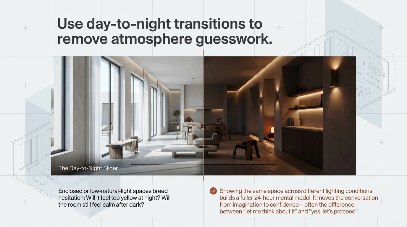
Use day-to-night transitions to remove atmosphere guesswork
One of the most common causes of hesitation is uncertainty around mood.
This becomes even more important in enclosed or low-natural-light spaces, where clients often ask questions like:
Will it feel too yellow at night?
Will the room still feel calm after dark?
Will the lighting read as warm or muddy?
A day-to-night visual sequence can answer those questions far better than a verbal explanation.
Showing the same space across different lighting conditions gives the client a fuller mental model of how it will live over 24 hours. It moves the conversation from imagination to confidence.
That confidence is often the difference between “let me think about it” and “yes, let’s proceed”.
How 3D Visualisation Helps Interior Designers Win Faster Approvals
From gallery thinking to approval strategy
Studios do not get faster sign-off by producing more imagery.
They get faster sign-off by improving the order of decisions.
That means:
answering the right questions earlier
separating lighting from materials
using visualisation to expose brief issues
presenting a curated approval set instead of an overwhelming gallery
When 3D visualisation is used this way, it stops being decorative output and starts becoming a strategic tool.
And that is where it creates its real value, not just in beautiful presentations, but in fewer revisions, clearer feedback, and quicker approvals.
Final thought
Great design does not usually stall because it lacks quality.
It stalls because the client cannot confidently see what you already see.
The role of visualisation is to close that gap.
When it does, the conversation changes. The project moves forward with more clarity, less friction, and a much better chance of protecting the original design intent.
FAQ
How does 3D visualisation help interior design approvals?
It helps clients understand the design more clearly, reducing uncertainty around layout, lighting, scale, and materials. That leads to more confident feedback and faster sign-off.
Can 3D visualisation reduce revisions in interior design projects?
Yes. When used as part of a staged approval workflow, 3D visualisation helps answer key questions earlier and prevents vague or reactive revision rounds.
How many renders should an interior design studio present to a client?
In many cases, a curated set of 6 to 10 strong views is more effective than a large gallery. Fewer, better-chosen images reduce overload and guide better decisions.
What is a clay pass in interior visualisation?
A clay pass is a neutral render without final materials. It allows the design team and client to evaluate spatial form and lighting separately from finishes.
If your studio is dealing with slow approvals, revision fatigue, or presentation cycles that keep expanding, I help interior design teams build clearer 3D approval workflows that protect design intent and speed sign-off.