Insights on visualisation, approvals, and presentation clarity
Thoughtful articles for interior design studios that want stronger presentations, clearer client communication, and a more effective visualisation process.
Practical AI Workflows for Visualisation Studios
AI should not replace a proper 3D pipeline. Used well, it becomes a fast pre-production layer that helps visualisation studios explore options, reduce revision pain, and make stronger decisions before final modelling and rendering begin.

Sinan Alajrad, Founder & Creative Director of SinanDesigns, partnering with interior design studios to create 3D visualisation that improves presentation clarity and speeds approvals.
In most visualisation projects, the early stage should be the fastest part of the process.
Instead, it often gets trapped in a familiar loop: brief, model, render, feedback, revise, repeat.
Every round takes time. Every extra revision drains momentum. And before long, the work starts feeling less like creative direction and more like manual iteration.
That is where AI can become genuinely useful.
Not as a replacement for a proper 3D pipeline, and not as a shortcut to approval-grade output, but as a pre-production layer that helps studios explore options, test ideas, and align decisions before committing time inside tools like 3ds Max, D5 Render, or a final rendering workflow.
Used at the right stage, AI can reduce revision pain, improve alignment, and make the rest of the pipeline more efficient.
Practical AI Workflows for Visualisation Studios
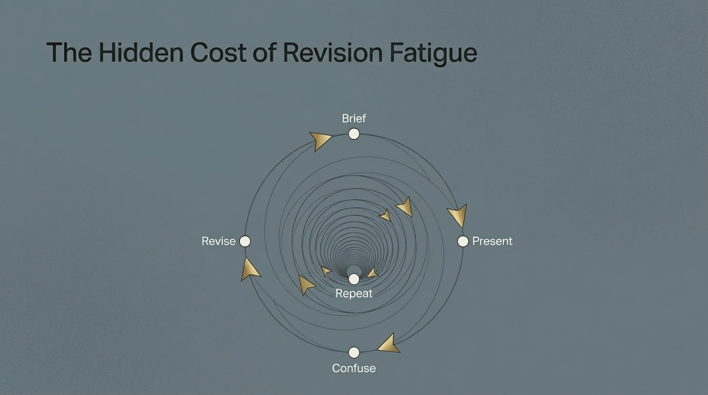
The problem, revision loops kill momentum
Most delays in visualisation do not come from one big failure.
They come from repeated small loops.
A client wants to test a different colour. A designer wants to compare two joinery directions. A stakeholder asks how the mood would change at golden hour. A team wants to see whether a concept still works with a new material or furniture piece.
Individually, these are reasonable questions.
The problem is what happens when each one requires re-modelling, re-materialising, re-lighting, and re-rendering.
That is when momentum disappears.
Practical AI Workflows for Visualisation Studios
The shift, use AI as a pre-production layer
A more useful way to think about AI is this:
Stage 1, AI exploration and alignment
Use AI to explore fast options, test moods, compare materials, and align direction early.
Stage 2, core 3D production pipeline
Once the direction is clearer, move into the controlled production stage where accuracy, consistency, and documentation matter.
Stage 3, final approved visuals
Deliver polished visuals that support stakeholder sign-off and communicate design intent with confidence.
This is where AI becomes practical, not as a replacement for production, but as a filter that helps teams reach better decisions before the heavy lifting begins.
What makes an AI prompt actually useful
The difference between a flashy image and a usable workflow usually comes down to structure.
A strong prompt is clear about four things:
1. Target
What exactly is being changed or generated?
2. Change
What action should happen?
3. Mood or style
What aesthetic direction should the output follow?
4. Constraints
What must stay the same?
Constraints are the part most people skip, and they are usually the difference between novelty and usefulness.
If the prompt does not preserve layout, proportions, camera position, scale, or lighting logic where needed, the output may look interesting but still be unusable in a professional workflow.
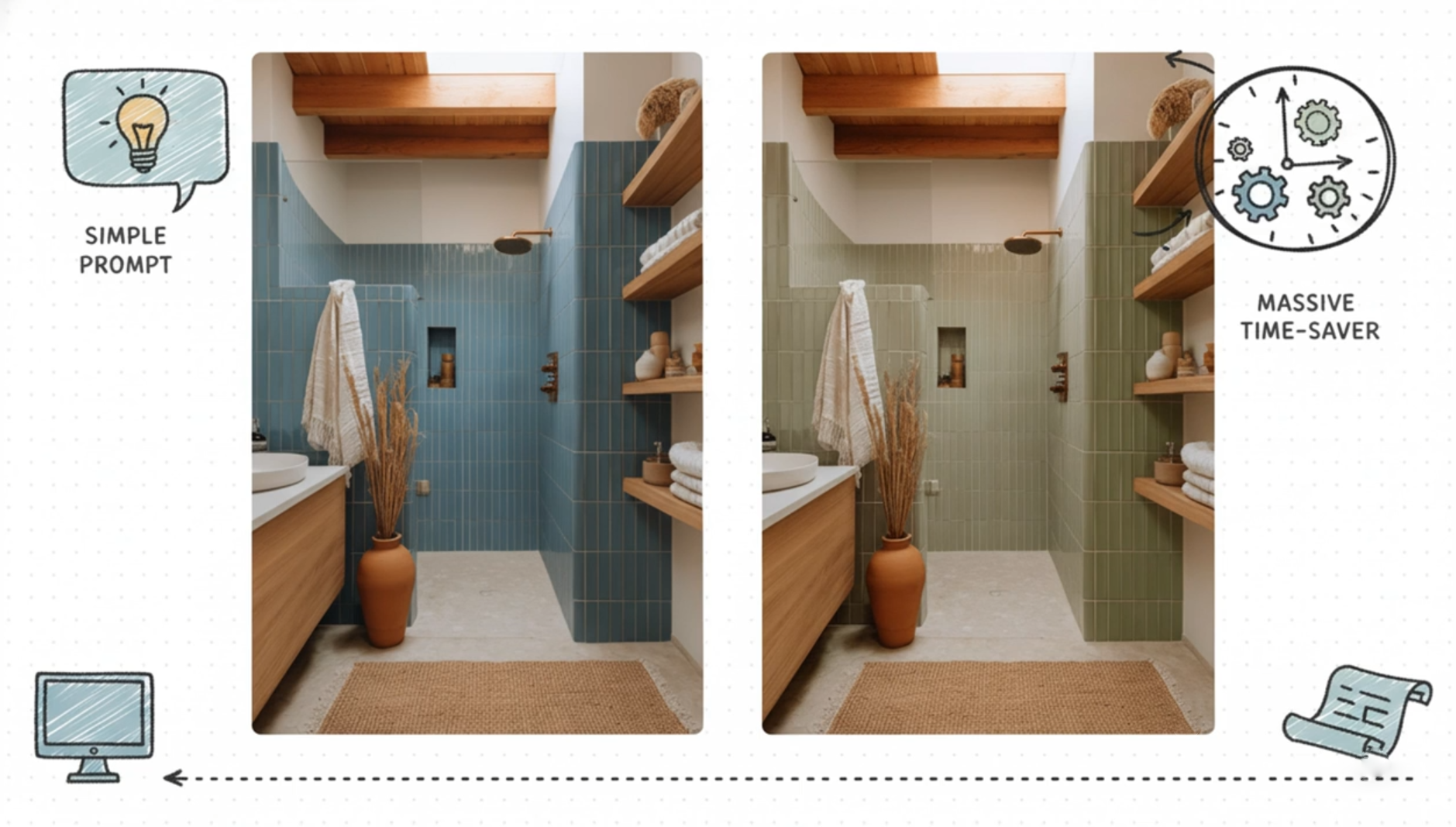
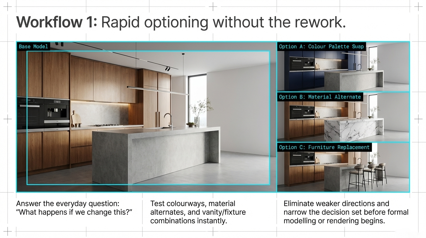
Workflow 1, optioning without the rework
One of the simplest and most valuable uses of AI is rapid optioning.
This is where the studio wants to answer the everyday design question:
“What happens if we change this?”
That might include:
colour palette swaps
material alternates
furniture replacements
vanity, backsplash, or fixture combinations
early mood direction before final material specification
Instead of rebuilding every variation from scratch, the team can use AI to test possibilities quickly, eliminate weaker directions, and narrow the decision set before formal production begins.
That does not replace proper modelling or rendering. It reduces wasted effort before they are needed.
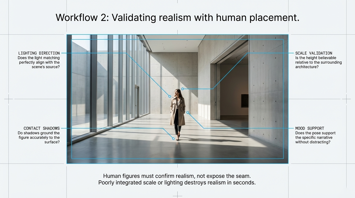
Workflow 2, checking realism with human placement
Human figures can make an image feel alive, but they can also destroy realism in seconds.
If the scale is slightly off, the contact shadow feels detached, or the figure ignores the scene’s lighting direction, the entire image starts to feel artificial.
That makes AI-assisted figure placement useful only when it passes a realism test.
When reviewing results, I would check:
whether the lighting direction matches the scene
whether contact shadows ground the figure properly
whether scale feels believable relative to furniture and architecture
whether the pose supports the mood rather than distracting from it
In other words, a human figure should confirm realism, not expose the seam.
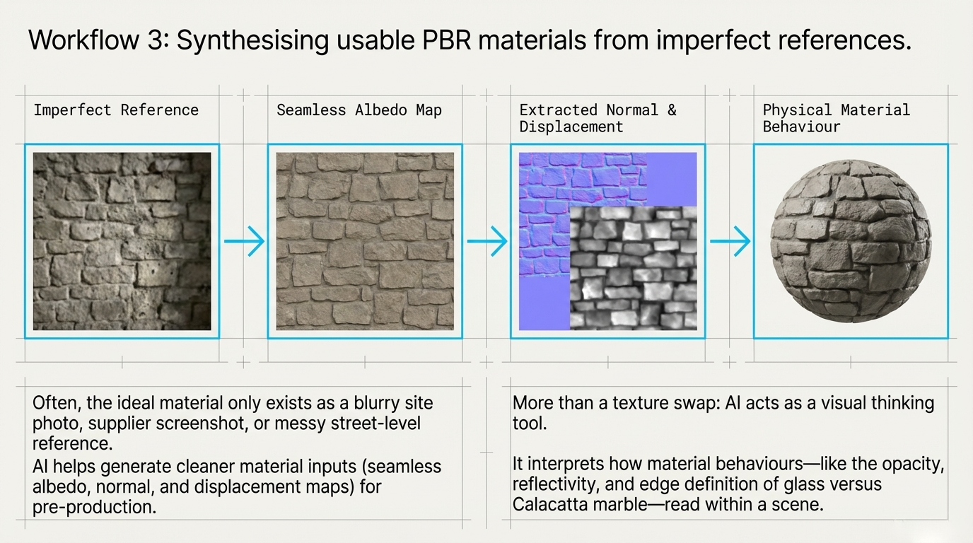
Workflow 3, building usable PBR materials from imperfect references
Sometimes the ideal material exists only as a rough reference:
a blurry site photo
a screenshot
a supplier image with poor consistency
a street-level reference that is visually useful but technically messy
This is where AI can help generate cleaner material inputs for pre-production.
A practical flow looks like this:
start with a reference image
generate or refine a seamless albedo
create supporting maps such as normal or displacement
assess whether the result behaves believably enough to guide the next stage
This becomes even more useful when the task is not just swapping texture, but interpreting material behaviour.
For example, changing a glass coffee table into white Calacatta marble is not only a colour change. It affects opacity, reflectivity, edge definition, weight, and the way the object reads within the scene.
That is where AI starts becoming useful as a visual thinking tool, not just an editing toy.
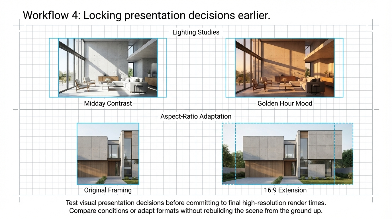
Workflow 4, locking presentation decisions earlier
Another strong use case is presentation planning.
Before committing to a final high-resolution render, AI can help test the visual decisions that shape how a concept will be presented.
Two of the most useful areas are:
Lighting studies
Testing midday, golden hour, overcast, or moodier interior conditions before fully building them into the renderer.
Aspect-ratio adaptation
Extending or reworking an image for formats like 16:9 without rebuilding the scene from the ground up.
This helps teams decide how the work should be shown before investing more time in the final presentation set.
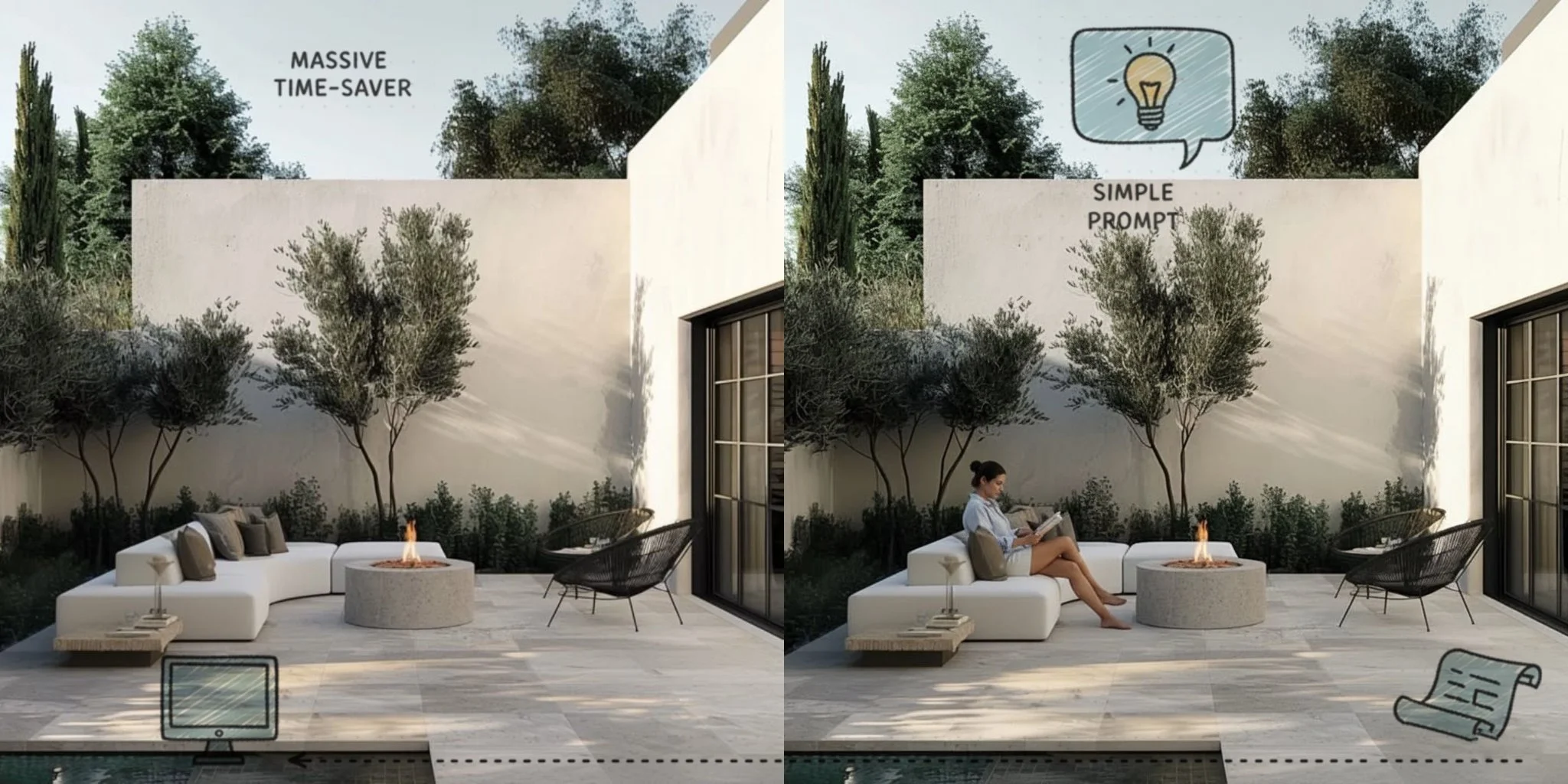
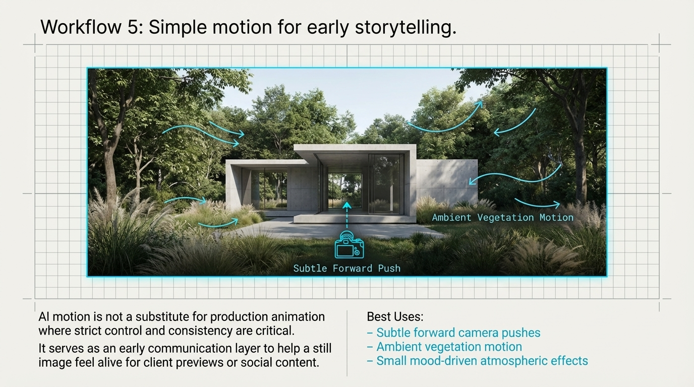
Workflow 5, simple motion for early storytelling
AI-generated motion is not a replacement for full animation.
But it can be useful for light storytelling.
Subtle forward camera movement, ambient vegetation motion, or small mood-driven effects can help a still image feel more alive for client previews, social content, or concept communication.
The important thing is to treat this as an early communication layer, not as a substitute for production animation where control and consistency are critical.
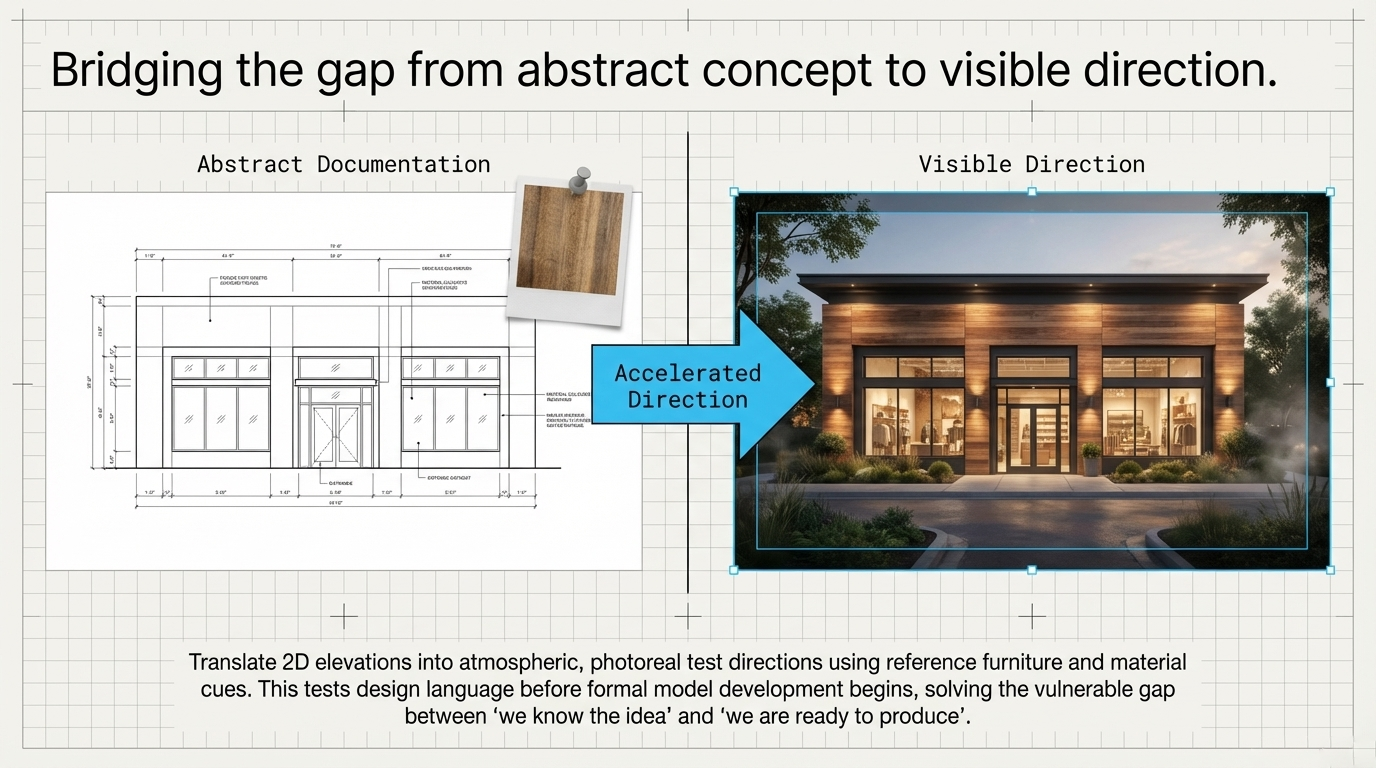
From abstract concept to visible direction
AI can also help teams move faster from early documentation into a more tangible visual direction.
That might mean:
translating a 2D elevation into a more atmospheric photoreal direction
using reference furniture or material cues to explore a cohesive interior concept
testing design language before formal model development begins
This is especially useful in the gap between “we know the idea” and “we are ready to produce the final visual”.
How 3D Visualisation Helps Interior Designers Win Faster Approvals
The boundaries still matter
This part is important.
AI is an accelerator, not an approval engine.
It can be excellent for exploration, direction-setting, and option testing. But it still has real limitations that professionals need to respect.
Those limitations include:
structural drift between views
limited camera control and repeatability
lower native resolution
unreliable accuracy for approval-grade or construction-grade output
That means it should support the workflow, not replace the controlled parts of it.
The integrated workflow
The most effective use of AI is not all-or-nothing.
It is staged.
A practical sequence looks like this:
AI pre-production layer for exploration, validation, and alignment
AI upscaling or bridging tools where needed for presentation
core 3D pipeline for refinement, control, and documentation
final visuals for confident delivery and stakeholder approval
That sequence protects what each tool is good at.
AI handles speed and exploration.
The production pipeline handles precision and accountability.
Final thought
For visualisation studios, the real value of AI is not hype.
It is decision speed.
When used properly, it helps teams test ideas earlier, reduce waste, and protect momentum before the formal production stage begins.
That makes it a practical addition to the workflow, especially when the goal is not simply to create more images, but to arrive at stronger visual decisions with less friction.
FAQ
Can AI replace a professional 3D visualisation workflow?
No. AI is useful for exploration and pre-production, but it does not yet provide the consistency, control, or technical reliability needed for approval-grade visualisation work.
What is the best use of AI in a visualisation studio?
Its best use is early-stage alignment: optioning, material studies, mood exploration, presentation planning, and reducing unnecessary rework before formal production begins.
Is AI useful for material exploration in archviz?
Yes. It can help test colourways, surface directions, and even generate supporting texture references, especially in the early exploration stage.
Where does AI fit in a 3D visualisation pipeline?
The most practical place is before full production, as a pre-production layer that helps narrow options and speed up decisions.
If you are exploring how AI can fit into your visualisation workflow without compromising quality, I help studios use it where it creates the most value, early, strategically, and in support of the real production pipeline.
If you want the prompt pack behind this workflow or want to discuss how this could fit your studio process, get in touch.
How Better Renders Save Time and Money
Basic renders may show dimensions, but they often fail to build confidence. Photorealistic renders help clients understand the design faster, reduce revision loops, and keep projects moving.
Sinan Alajrad, Founder & Creative Director of SinanDesigns, partnering with interior design studios to create 3D visualisation that improves presentation clarity and speeds approvals.
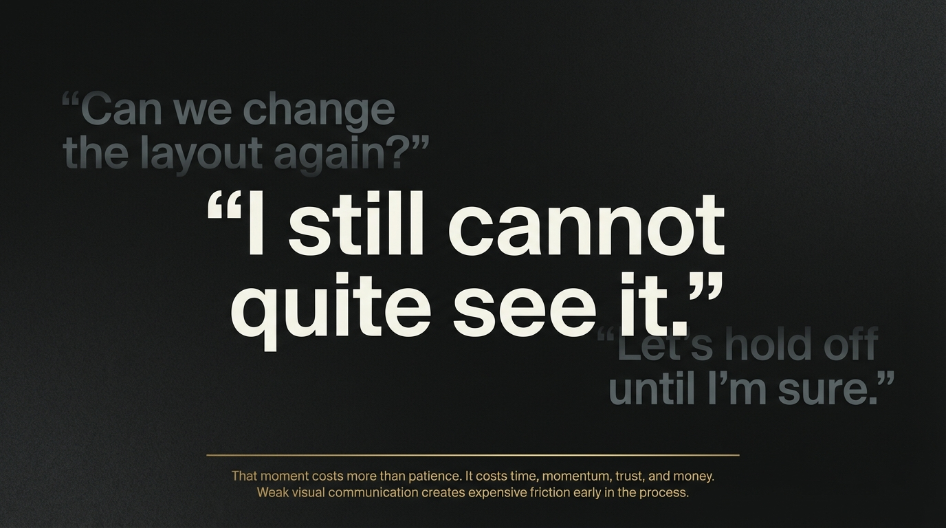
Have you ever presented a design and watched the client hesitate?
They lean forward, study the image, and then say something like:
“I still cannot quite see it.”
“Can we change the layout again?”
“Let’s hold off until I’m sure.”
That moment costs more than patience.
It costs time, momentum, trust, and money.
For architects, builders, developers, and interior design studios, weak visual communication often creates expensive friction early in the process. A render may technically show the design, but if it does not help the client feel the space, understand the intent, and make a confident decision, the project can drift into unnecessary revision rounds.
That is where better renders create real value.
Photorealistic visualisation does more than make a project look polished. It helps people understand the design faster, approve it with more confidence, and move forward with less back-and-forth.
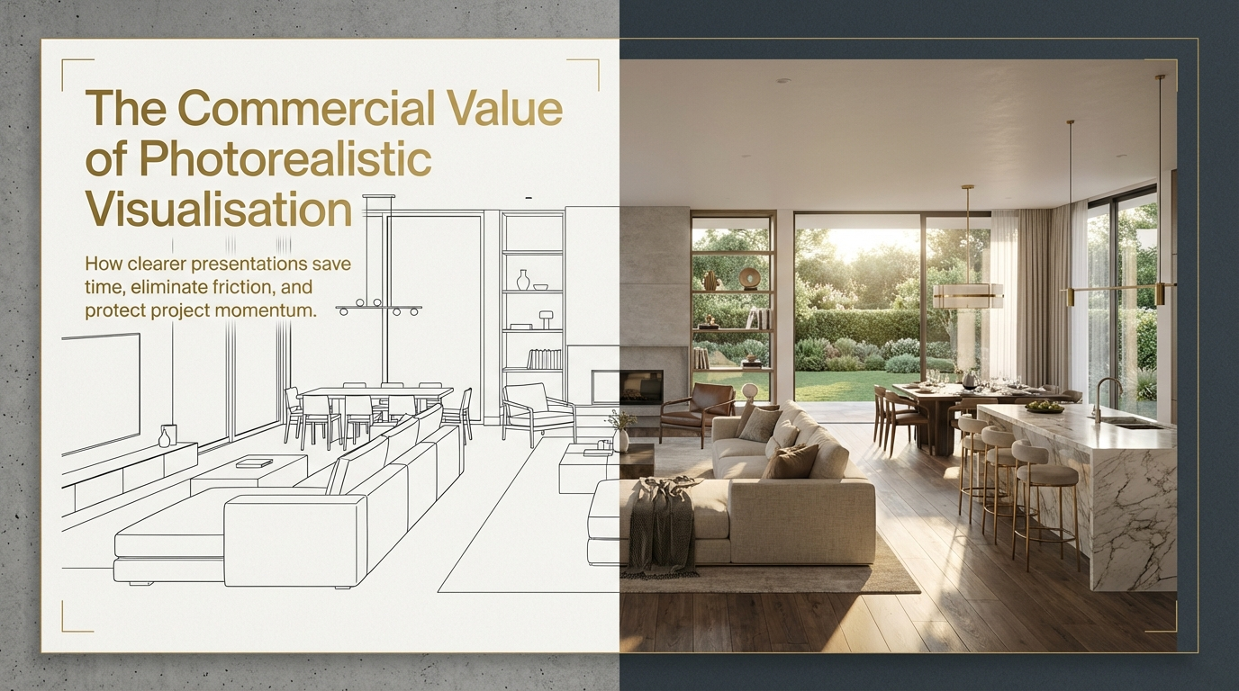
How Photorealistic Renders Save Time, Reduce Revisions, and Speed Approvals
Why basic renders often slow projects down
A basic render can communicate dimensions and general layout.
But that is not always enough for decision-making.
Clients, consultants, and stakeholders usually need more than technical representation. They need clarity around atmosphere, materiality, scale, and how the space will actually feel.
When a render leaves too much open to interpretation, several things tend to happen:
feedback becomes vague
revisions multiply
stakeholders introduce late concerns
approvals take longer than they should
At that point, the problem is not the design. It is the gap between the design intent and what the viewer is able to understand.
How Photorealistic Renders Save Time, Reduce Revisions, and Speed Approvals
Why photorealistic renders create faster decisions
When a render feels believable, the conversation changes.
Clients stop trying to imagine the outcome and start responding to something they can mentally step into.
That shift matters.
Because once the design feels clear, decision-making becomes easier. The client can assess the mood, the materials, the scale, and the visual hierarchy with much more confidence. That usually leads to more focused feedback, fewer unnecessary changes, and faster progress.
In practical terms, stronger renders help by:
reducing confusion in meetings
improving trust in the design direction
making stakeholder feedback more specific
helping approvals happen with fewer cycles
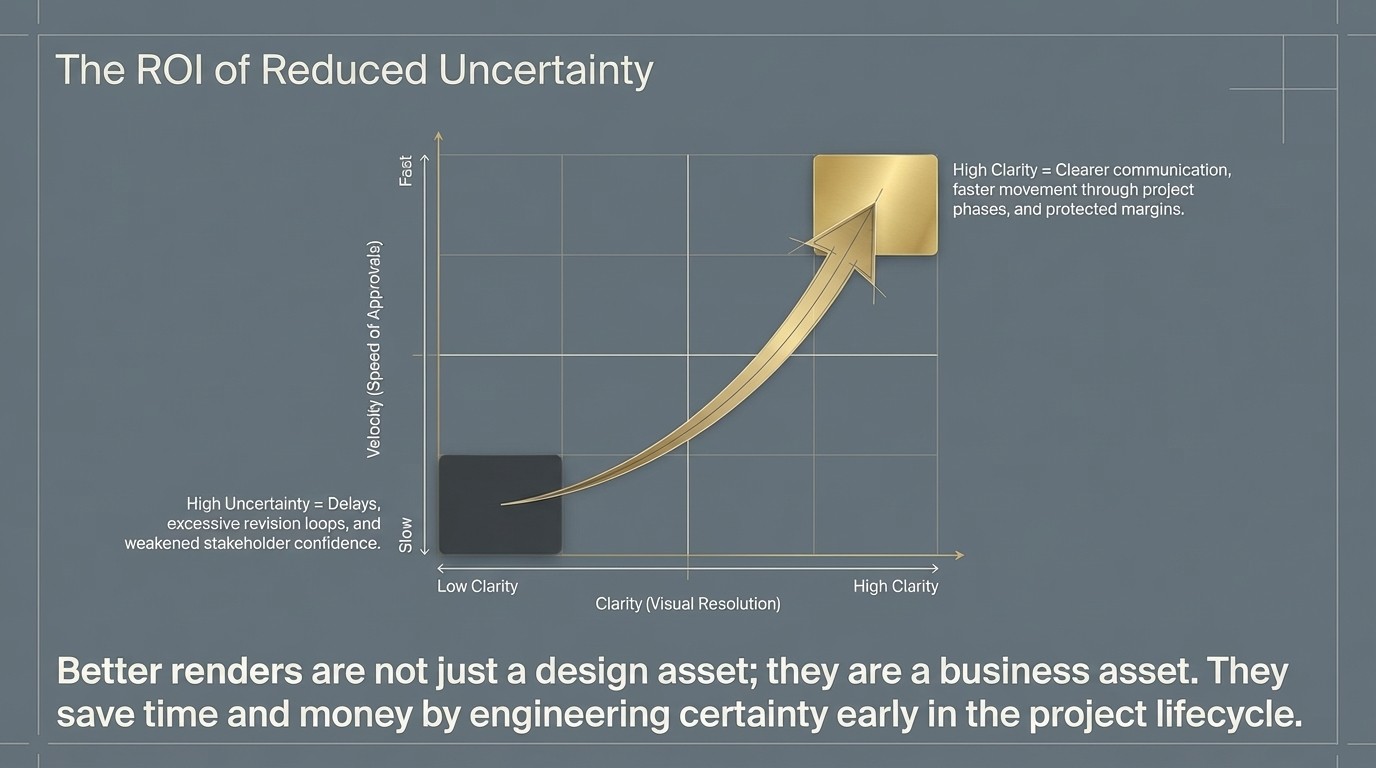
This is why better visualisation is not just a presentation upgrade. It is a workflow advantage.
Better clarity means less revision waste
One of the biggest hidden costs in design and development is revision fatigue.
Every extra round absorbs time from the team. It delays related decisions. It often pulls the project away from its strongest original direction.
Photorealistic renders can reduce that waste because they answer questions earlier.
Instead of relying on plans, elevations, or flat imagery alone, the project team can test whether the space feels balanced, whether the materials are reading correctly, and whether the design communicates the intended level of quality.
That kind of clarity helps eliminate the classic loop of:
brief, present, confuse, revise, repeat.
Better renders also support faster approvals
Approvals tend to slow down when stakeholders are unsure what they are approving.
The more realistic and precise the visual communication, the easier it becomes for clients and decision-makers to understand what is being proposed.
That matters whether the goal is:
client sign-off
internal alignment
investor confidence
marketing and pre-sale support
smoother planning conversations
A render that builds confidence reduces hesitation. And hesitation is often where timelines begin to leak.
Why this matters for Interior design studios
For Interior designers, the value of a render is not simply aesthetic.
It is commercial.
A stronger image can help communicate value earlier, support approvals, present the project with more authority, and reduce the friction that comes from unclear expectations.
When clients and stakeholders understand the vision sooner, the project has a better chance of moving with momentum.
That is where visualisation starts affecting return on investment, not because the image is prettier, but because the project spends less time stuck in uncertainty.
Why photorealistic renders create faster decisions
In Adelaide, clarity is a competitive advantage
In a market where many studios still rely on basic presentation imagery, stronger visual storytelling can create a clear edge.
The firms that present with clarity tend to:
build trust faster
communicate quality more effectively
create stronger first impressions
move projects forward with fewer delays
In that sense, better renders are not just a design asset. They are a business asset.
What good renders actually do
A strong render should do more than fill a board or decorate a pitch deck.
It should help the viewer:
understand the design immediately
feel the intended atmosphere
read the scale and materiality correctly
trust the direction enough to make a decision
That is the real benchmark.
If the image looks nice but still leaves the client uncertain, it is not doing enough work.
Final thought
The value of a better render is not only visual quality.
It is what that visual quality unlocks:
clearer communication
fewer revisions
stronger stakeholder confidence
faster movement through the project
In other words, better renders save time and money because they reduce uncertainty.
And in design, uncertainty is usually the most expensive thing in the room.
FAQ
Do photorealistic renders reduce design revisions?
They often help reduce unnecessary revisions because they make the design easier to understand early, especially around mood, scale, and materiality.
Why do realistic renders help with approvals?
Because clients and stakeholders can make decisions more confidently when they can clearly visualise the final outcome.
Are basic renders enough for client presentations?
Sometimes, but if the project depends on emotional buy-in, material clarity, or premium positioning, basic renders often leave too much open to interpretation.
Who benefits most from photorealistic renders?
Architects, interior designers, builders, and developers all benefit when clearer visuals lead to faster feedback and smoother approvals.
If your projects are getting delayed by unclear presentations, revision loops, or hesitant client feedback, I help Interior design studios use photorealistic visualisation to create clearer decisions and faster momentum.
Why Adelaide Studios Lose Projects They Should Win, and How Premium Visualisation Fixes It
Many studios lose projects not because the design is weak, but because the presentation leaves too much to the imagination. Here is how premium visualisation helps Adelaide practices communicate more clearly and win with confidence.
Sinan Alajrad, Founder & Creative Director of SinanDesigns, partnering with interior design studios to create 3D visualisation that improves presentation clarity and speeds approvals.
Every studio knows the feeling.
You walk out of a client meeting thinking the presentation landed well. The design was strong. The concept made sense. The conversation felt positive.
Then the follow-up comes.
“We just need to think about it.”
“The other studio felt more confident.”
“We’re still deciding.”
In many cases, the problem is not the design.
It is the way the design was presented.
Studios can produce excellent concepts and still lose projects when the visuals fail to carry the same level of quality, confidence, and emotional clarity. Plans may be accurate. Renders may be technically acceptable. But if the client is still being asked to imagine too much, hesitation steps in.
That gap between design intent and client perception is where good projects are often lost.
Why Adelaide Studios Lose Projects, and How Premium Visualisation Helps Them Win
Why strong studios still lose work
Many architecture and interior design studios do good work.
The issue is not capability. It is communication.
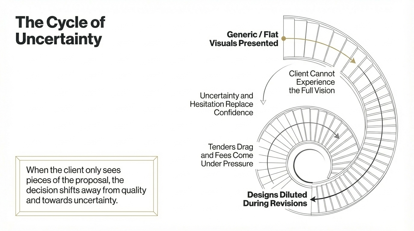
When presentation visuals feel flat, generic, or mid-tier, the client does not fully experience the strength of the idea. They see pieces of the proposal, but not the full value of the vision. And when that happens, the decision often shifts away from quality and towards uncertainty.
That uncertainty shows up in familiar ways:
clients hesitate instead of committing
tenders drag on longer than they should
fees come under pressure
designs get diluted during revisions
approvals lose momentum
This is not always dramatic. Often it builds quietly.
A studio may feel like it is “doing alright”, while underneath, presentation quality is quietly reducing close rates, slowing decisions, and making every new opportunity harder to win than it should be.
Why Adelaide Studios Lose Projects, and How Premium Visualisation Helps Them Win
The hidden cost of presenting below your standard
One of the biggest risks for a growing studio is not obvious failure.
It is steady underperformance that feels normal.
If your concepts are strong but your visuals do not match that standard, you end up relying on explanation to do work that the presentation should have done for you. That usually means:
more time spent defending design decisions
more objections during meetings
more sensitivity around price
less authority in competitive presentations
Over time, that becomes expensive.
Because when clients cannot clearly see the value of the design, they start comparing studios on the wrong things.
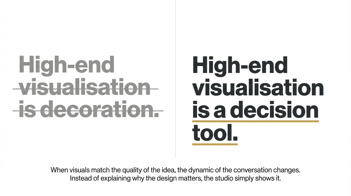
Why premium visualisation changes the outcome
High-end visualisation is not decoration.
It is a decision tool.
When the visuals match the quality of the idea, clients understand the concept faster. They trust it sooner. They respond to the atmosphere, the intent, and the overall experience of the project rather than just its technical description.
That changes the dynamic of the conversation.
Instead of explaining why the design matters, the studio can show it.
And when the concept feels clear and believable, several things tend to improve:
client confidence rises
hesitation drops
approvals move faster
revisions become more focused
the studio appears stronger before fees are even discussed
That is the real value of premium visualisation. It helps the best ideas land with the weight they deserve.
Why Adelaide Studios Lose Projects, and How Premium Visualisation Helps Them Win
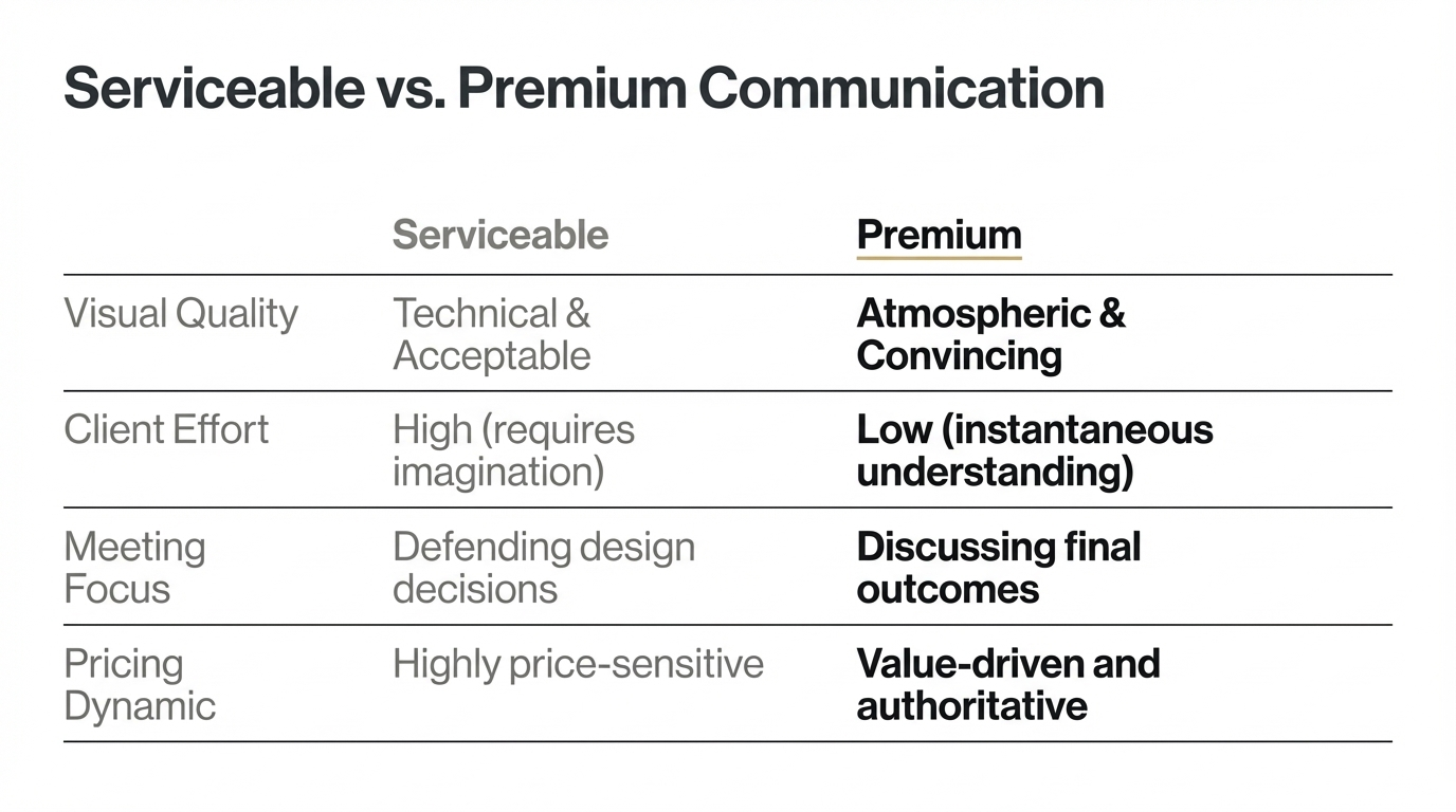
This is not about prettier renders
There is a common misunderstanding that better visualisation simply means more polished imagery.
That is only part of it.
The real difference is psychological.
Premium visualisation reduces the mental effort required from the client. It helps them understand what they are looking at, how it will feel, and why it matters. It removes ambiguity before ambiguity turns into objections.
In that sense, visualisation is not only about image quality. It is about:
clarity
trust
authority
emotional connection
decision speed
That is why it influences outcomes far beyond the render itself.
My approach to premium visualisation
Every project I work on is built around a simple framework:
Problem
Most visuals show what a space looks like, but not why it matters.
Solution
Use light, composition, material clarity, and atmosphere to help the client feel the design before it exists.
Product
Create renders and animations that communicate the concept with enough clarity and emotional weight to support faster decisions.
The goal is not to make the image look expensive.
The goal is to help the project feel convincing.
Why Adelaide Studios Lose Projects, and How Premium Visualisation Helps Them Win
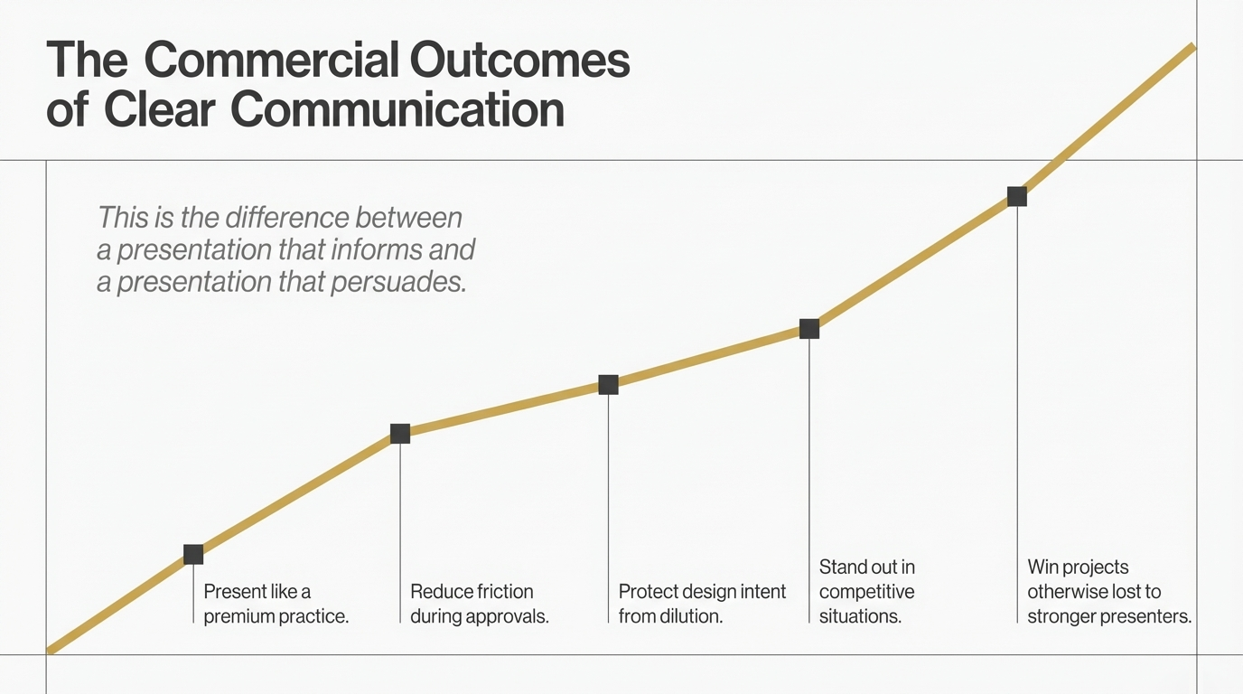
What better visual communication leads to
When premium visualisation is used properly, it helps studios:
present like a premium practice
reduce friction during approvals
protect design intent from being watered down
stand out in competitive situations
win projects that might otherwise be lost to stronger presenters
That is the difference between a presentation that informs and a presentation that persuades.
Why this matters in Adelaide
In Adelaide, many studios are still presenting strong design work with visuals that feel serviceable rather than compelling.
That creates an opening.
The studio that communicates more clearly often feels more established, more premium, and more trustworthy, even when the difference in design capability is not dramatic.
This does not mean louder branding or more complicated presentations.
It means clearer visual storytelling.
The firms that present with confidence, atmosphere, and precision often create momentum earlier because the client is no longer being asked to fill in the blanks.
Final thought
Studios rarely lose the right project because the idea lacked quality.
More often, they lose it because the presentation did not carry that quality clearly enough.
Premium visualisation fixes that gap.
It helps clients understand faster, trust sooner, and move forward with more confidence.
And in a competitive market, the studios that communicate most clearly are often the ones that win.
FAQ
Why do design studios lose projects even when the design is strong?
Often because the presentation leaves too much open to interpretation. When clients cannot fully picture the outcome, hesitation increases.
What does premium visualisation actually improve?
It improves clarity, emotional connection, trust, and decision-making. That can support faster approvals and more confident presentations.
Is premium visualisation only for luxury projects?
No. It is most valuable anywhere a studio needs stronger buy-in, clearer communication, or more persuasive presentation.
Why does better visualisation help studios compete less on price?
Because clearer, more compelling presentations make the value of the design easier to understand, which reduces the chance that the decision is based only on fees.
If your studio is producing strong design work but your presentations are not converting with the confidence they should, I help Adelaide interior designers use premium visualisation to create clearer presentations, faster approvals, and stronger commercial outcomes.
Explore the work, or get in touch to discuss your next project.